How Infinite Red uses Overflow to improve asynchronous communication with their clients
Overflow Team in Overflow Storybook
With Jenna Fucci, Senior Designer, and Justin Huskey, Design Lead

Introduction
With multiple clients across different time zones and an in-house design team taking care of client projects from A to Z, Infinite Red strived to improve its asynchronous design review process. Justin Huskey, the company’s Design Lead, and Jenna Fucci, a Senior Designer at Infinite Red, shared how they tried Overflow in a moment of need and ended up with a long-term solution to a long-standing communication problem.
The challenge
Engaging clients in asynchronous design critique was a long and fragmented process
Infinite Red has a small design team that is very hands-on with client work. As they design and develop iOS and Android apps for small businesses and startups, their work involves a lot of back and forth with clients to review each step of a project. Jenna, who is more directly involved with clients, usually organizes weekly catch-ups via conference call or asynchronously via email, seeking feedback or approval to move forward.
Before 2021, Infinite Red was using Invision prototypes to conduct design critiques with clients. Jenna remembers writing long messages on Slack to outline exactly what clients had to review and trying to predict any pitfalls they might encounter while going through the project screens. The process was often clunky — there were times clients were unsure where they had to click to move forward and explore all screens and connections between them. In one extreme case, a client signed off a project having reviewed only 60% of it, as the rest was not directly visible on their screen.

The solution
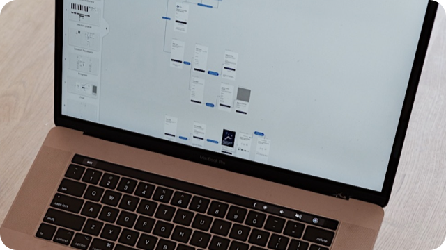
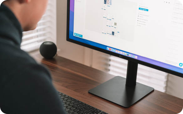
Presenting clients with a bird’s-eye view of the whole project in Overflow
Infinite Red first tried Overflow in 2021. Justin and Jenna recall being in the middle of a project with an unusual number of back and forths when they felt it was time to change how they communicated design work to clients. Overflow was one of the options they explored, and since then, the tool has become a staple in their workflow.
“Within a day I made my first clickable, annotated wireframe. On the first try, our client managed to review our work and send their feedback.” — Jenna Fucci, Senior Designer
Use cases
According to the Infinite Red design team, they use Overflow in more than one way. They specifically numbered the following four use cases, spread across different steps of the app design and development process:
- Asynchronous design review: The area where Infinite Red sees the biggest benefit of using Overflow. Whenever time zone differences make synchronous communication challenging, the team generates a publication link and sends it to the client via email accompanied by 2–3 lines of simple instructions. The client reviews and leaves feedback via Overflow comments. This process is repeated weekly until the final sign-off.
- Synchronous design review: When the time difference does not pose an obstacle, designers of Infinite Red arrange weekly conference calls with their clients, where they share their screen to showcase their progress and get instant feedback.
- Early ideation: Infinite Red sometimes uses Overflow during the early design stages to put together wireflows of how they envision a project’s information flow. They use this to provide clients with a recommendation of how content should spread across different screens of the final app.
- Variant comparison: Occasionally, the designers of Infinite Red offer clients different recommendations to pick from. Options might differ in terms of visual design or in regards to screen connections and user journey. Overflow makes it easy to compare between versions, either by presenting them side-by-side or in different boards of the same publication link.

The results
Time and communication efficiencies across the board
According to Justin, the benefit his team enjoys by using Overflow is two-fold: saving time and effort for the team and improving alignment with clients.
Time-saving is crucial, as Infinite Red comprises a small design team that iterates on designs often. In the past, it took a long time to update Invision prototypes or Miro flows manually to offer an equally good experience to the client each time they went through a new round of review.
“With Overflow we don’t need to redo all our work every time there’s a change; we just update the board and the whole user flow remains intact.” — Justin Huskey, Design Lead
Jenna also sees this from another angle: being constantly busy with hands-on design work makes writing long walkthrough emails to clients a considerable struggle. Overflow allows her to spend more time on what’s important to the project and worry less about documentation, as Overflow’s bird’s-eye view and interactive, visible connectors make everything pretty self-explanatory.
Infinite Red noticed a huge improvement in its communication with clients. According to Justin, clients seem overall much more aligned with the team, while back and forths, although still existent, have diminished. Jenna adds that one thing that has saved them from many misunderstandings is that the client won’t get exposed to any iterations in real-time. The team can update publication links whenever they feel their work is ready for review.
The company

Infinite Red has over 10 years of track record in designing, building, and shipping apps remotely for clients worldwide. The US-based company specializes in all things React Native. Apart from its main business of developing apps, Infinite Red is also very committed to keeping the React Native community connected and informed by sharing educational content and organizing meetups and conferences.
Do you have a similar story to share? Let us know via comment here or on our Twitter, Facebook, or Instagram accounts, and we’ll get in touch!
Article written and curated by Constantinos Vitoratos.
Build meaningful design presentations and engage your audience in design critique