How Afelio achieved significant time and productivity gains with Overflow
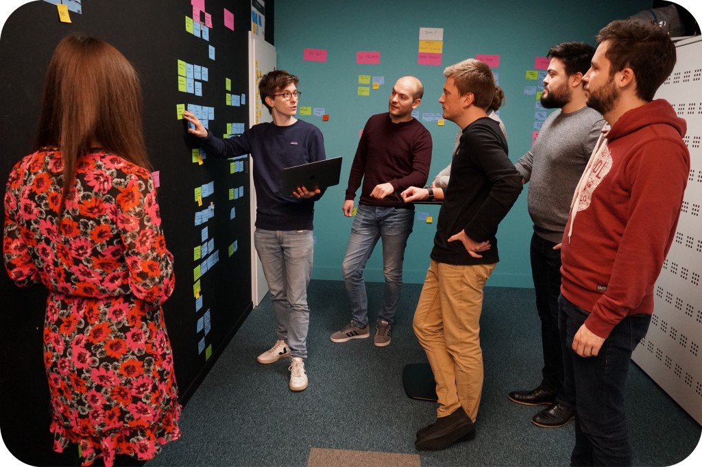
Overflow Team in Overflow Storybook
With Florence Loix, UX Architect

Introduction
As a company that brings complex digital experiences to life, Afelio heavily depends on producing a large number of early-stage UX mockups for different projects. Seeing that their old tools were not on par with their needs, they looked for a solution to make the process more efficient. Florence Loix, one of Afelio’s UX Architects and a member of the Strategy team, shared with us how her team adopted Overflow to make the early-stage ideation process more efficient and complement both the ideation and documentation workflows.
The challenge
Using non-specialized tools made the team’s workflow feel clunky
Afelio digitalizes the public-facing processes and resources of big organizations, including major banks, insurance, and energy companies, as well as public sector institutions. The whole process starts with a deep analysis of the client’s existing situation and desired future position. Florence’s team is heavily involved in strategic early-stage ideation, using data and UX principles to produce low-fidelity maps of what the user experience should look like for each part of the project. These documents are then presented to the design team and developers to bring the strategic concept to life.
Before Overflow, Florence and her team used other, non-specialized tools to produce these early-stage user flows. However, she remembers that the process was tedious and frustrating for her and her peers. More specifically, she found the drawing of connectors to be too manual and impractical, while moving things around could easily make a mess of the flow. Corrections took time, and annotating the final document also required some extra creativity to work.
“Our old tools were not really made for diagramming purposes. When you played with arrows or moved things up and down the process felt broken.” — Florence Loix, UX Architect

The solution
Adopting Overflow as the team’s specialized diagramming tool
Afelio’s UX team started using Overflow in an effort to cut down on time spent on low-fidelity diagramming. Florence revealed that all 15 members of her team, including herself, use Overflow daily for the purpose. As the team prepares particularly complex diagrams, they often take advantage of Overflow’s multiple boards feature so that they can break their work into smaller, more digestible sub-flows.
Each low-fidelity diagram prepared by the Strategy team is then internally presented to designers so that they can start producing high-fidelity designs. As design proceeds, finished screens are also introduced in the diagram to give the user flow a more polished look. Afelio uses the Overflow plugin for Sketch to do this quickly and easily.
Use cases
Afelio uses Overflow in multiple stages of the product development process, as follows:
- Early-stage ideation: As already mentioned, this is Afelio’s primary use case. UX architects put together complex UX maps of digital experiences using shapes, connectors, and annotations. These function as the project’s main source of truth for both the internal team and the client.
- Designer onboarding: The strategy team that created the low-fidelity flows uses the Overflow document to present the logic behind the project to the design team. Based on the information they receive, designers start giving the new app or website its new face.
- Developer handoff: Afelio’s software engineering team uses the Overflow document alongside a prototyping link provided by the designers to start bringing the whole project to fruition.
- Client presentation: Some of Afelio’s clients want to have a say on how their new digital experience will work for the end user. In such cases, the strategy team shares the Overflow document with the client, encouraging them to give feedback on specific sub-flows.

The results
Better UX diagrams, faster
Florence claims that Overflow gave her and the rest of her peers a significant speed boost when it comes to putting together user experience maps of their new projects. As Overflow is a specialized diagramming tool, the whole experience of connecting and annotating elements on the canvas feels more organic.
“Our old process took 1.5 times longer than it does now that we use Overflow.” — Florence Loix, UX Architect
Another feature that she appreciates is the big variety of shapes, as well as connector and shape styles. As the Afelio Strategy team creates complex UX maps, different styles make it easier for internal and external stakeholders to navigate through the document. In the same track of thought, Florence mentioned that one of her favorite features in Overflow that many other tools don’t offer is the multiple boards functionality. This feature allows her to break big diagrams into smaller sub-flows that are easier to follow while everything remains accessible within the same Overflow document.
Lastly, Florence thinks Overflow was a straightforward tool for her and the rest of the team to learn. She compares the process to a particular childhood memory:
“I would say Overflow was really easy to use, it felt like the LEGO we used to play with as children, putting pieces together.” — Florence Loix, UX Architect
Overall, the output that the Strategy team produces with Overflow is essential both for presentation, as well as documentation purposes. While there’s an industry trend to use as few tools as possible or even look for a one-tool-fits-all solution, Florence believes it’s better to stick to specialized tools, especially when the team spends significant time and effort on specific processes.
The company

Since 2013, Afelio supports big organizations in their digital transformation. With an agency mindset and a tech-oriented approach, it offers a wide range of services, from digital strategy consultation all the way to building modern, intuitive digital applications and websites. Afelio is part of the NRB group and is headquartered in Liège, Belgium.
Do you have a similar story to share? Let us know via comment here or on our Twitter, Facebook, or Instagram accounts, and we’ll get in touch!
Article written and curated by Constantinos Vitoratos.
Build meaningful design presentations and engage your audience in design critique