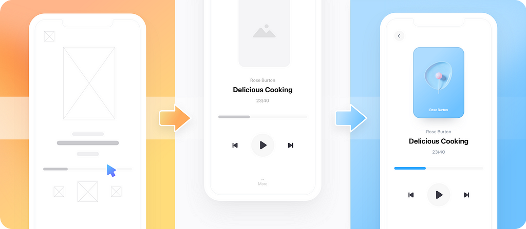
In the past decade user flows became a popular way for designers to showcase their work to teammates, clients, and other stakeholders. However misconceptions, such as whether user flows are just more complex wireframes, are still widespread. Most of them usually stem from the debate over design fidelity, with many designers claiming that user flows should only contain low fidelity designs, whereas prototypes are the way to go when evaluating finished projects.
In this article, we’ll discuss design fidelity as an integral part of diagramming and see how each fidelity level best applies to different stages of the product design process.
Low fidelity user flows
A large portion of product designers choose to design user flows comprising just shapes and connectors. These flows are extremely easy and quick to make and can bring many different stakeholders in alignment from the very early stages of a project. Please note that low fidelity user flows and flowcharts are not the same thing, although they often look alike.
The main benefit of these user flows is that they can help save major design and development resources. Without an early-stage flow, teams often overlook bottlenecks and logic issues in their envisioned product, which would lead whole teams to a series of endless loops. A low fidelity user flow allows for optimizations before design and development starts, so that the whole effort is more cost-efficient and productive.
Lastly, another thing that makes low fidelity flows so popular is that they can literally be created with minimum design and technical skills. All it takes is a stable hand, a pen, and a piece of paper – although creating them in a more specialized diagramming tool has multiple benefits, such as added presentation interactivity, the ability to share via share link, etc.
Medium fidelity user flows (a.k.a. wireflows)
If a wireframe showcases the layout of a screen’s intended UI, then a wireflow is a collection of all these individual wireframes connected together in the form of a user flow.
Medium fidelity user flows are also mostly used in the early stages of the design process. Contrary to low fidelity flows, however, wireflows do require a small design effort to be produced. They ideally also require knowledge of some basic design principles, so that there’s a good balance between individual screen functionality and logical screen-to-screen interactions.
Wireflows can also be designed on a piece of paper, however they usually require a level of playability and presentability to make more sense to a wider audience that is not directly involved in the project. This is usually the first type of flow a client would be presented with for preliminary review; therefore, it’s really important that it looks professional and doesn’t raise too many unnecessary questions that could delay the whole product design process.
High fidelity user flows
After a few iteration cycles, negotiations, and discussions, the design process eventually proceeds towards its final stage. This is where high fidelity user flows come into play.
High fidelity flows comprise finished or close to finished design screens connected with each other, annotated appropriately, and ideally split into subflows. At this stage product design is most likely presented to the client or other stakeholders for final review (also known as design sign-off), therefore everything is expected to look crisp, tidy, and polished.
Based on all the above, it shouldn’t come as a surprise high fidelity user flows take time and effort to make. They also require specialized UI and visual design skills, which means that not anyone in a wider team can produce them. Ideally, these flows shouldn’t be produced before stakeholders have agreed on an earlier-stage flow, to avoid unnecessary reworks on the user journey itself and be able to focus on the visual aspects of the design.
Hybrid user flows
As with many other processes, product design is not always linear. Products comprise multiple subflows, some of higher priority than others, while different teams might be working on different parts of the user experience asynchronously. User flows should also evolve accordingly alongside the rest of the process, meaning that some parts of a flow might be of lower fidelity than others.
Another reason why a user flow might comprise screens or elements of different fidelity is that parts of the user experience might be taking place outside of the product itself; for instance, payment or delivery might be handled by a third party vendor. In such cases there’s no need to spend resources or energy to include those screens inside the user flow diagram, as they are outside the direct control of the product design team.
Are user flows an integral part of your team’s workflow? If yes, what design fidelity do you usually go for? Let us know by dropping us a message on Twitter, Facebook, or Instagram!
Article written and curated by Constantinos Vitoratos.
Build meaningful design presentations and engage your audience in design critique