User flow VS flowchart: Similarities and differences of two commonly mixed-up diagrams
Overflow Team in Overflow Storybook

In a UX and product design landscape that keeps reinventing itself, it’s not surprising to get exposed to many new buzzwords — often without much prior explanation. Two such terms that you have probably heard a lot (often interchangeably) are user flow and flowchart. In reality, however, these two common types of diagrams are not just different in regard to what they represent but also when it comes to who needs them and for what purpose.
This article outlines the main similarities and differences between these two popular types of diagrams from a UX and product design perspective, so you can decide which one best suits your needs based on where your product currently stands in the product development process.
What is a user flow?
A user flow is the visual representation of the path(s) a user can take, in order to achieve a specific goal. In their most basic form, user flow diagrams combine visuals (screens, shapes, or images) with connectors, in order to define the sequence of steps towards the desired outcome. More complex or presentation-ready user flow diagrams can comprise extra elements, such as labels, device skins, branding details, etc.
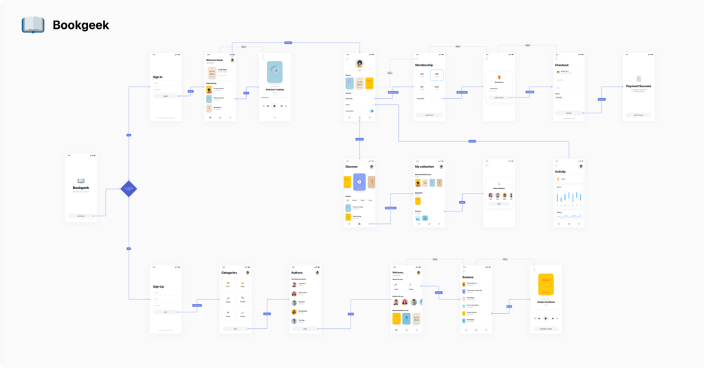
Let’s take as an example the above user flow diagram of an audiobook app. Upon logging in, the user’s main goal is to find audiobooks of their liking and listen to them. They can do so in more than one way, depending on different factors, such as if they have signed up before, if they have an active paid membership, and so on. User flows take all those scenarios into consideration and present different paths to success in a digestible, easy to follow way.
What are the benefits of user flows?
In comparison to flowcharts, user flows are a more visually effective way to present the user journey as a whole, while still seeing all project screens laid out close to one another. This gives user flows the advantage of more context, which helps onboard stakeholders faster during design critique, while leaving less to imagination or personal interpretation.
Additionally, user flows are extremely versatile when it comes to transforming and adapting to more advanced stages of the product design and development process. Wireframes, low fidelity, or high fidelity designs can be used whenever they become available. Additionally shapes, connectors, and annotations can be added at any stage, depending on the type of presentation delivered. That makes user flows a valuable tool from early ideation, all the way to final documentation. User flows are also particularly valuable when trying to iterate on already launched products.
What is a flowchart?
A flowchart (also spelled ‘flow chart’) is a diagram that depicts a process, workflow, or system in sequential steps. Flowcharts are usually simple in terms of appearance, comprising different shapes connected with arrows. In the context of product design, flowcharts are usually a tool to quickly depict the intended behavior of an app, while in the early ideation phase. Flowcharts never contain visuals; diagrams containing even some wireframes or hand sketches are called wireflows instead, blending the terms ‘wireframe’ and ‘user flow’.
A unique element of flowcharts that can complicate things for beginners is the use of different shapes or symbols to represent different steps of a process. For instance, a diamond shape represents a decision that often branches the flowchart out to at least two different paths, depending on the outcome of the decision. Another example is the oval shape (also known as capsule or pill shape), which represents starting or ending points. We’ve summarized the most commonly encountered flowchart shapes in the image below for reference.
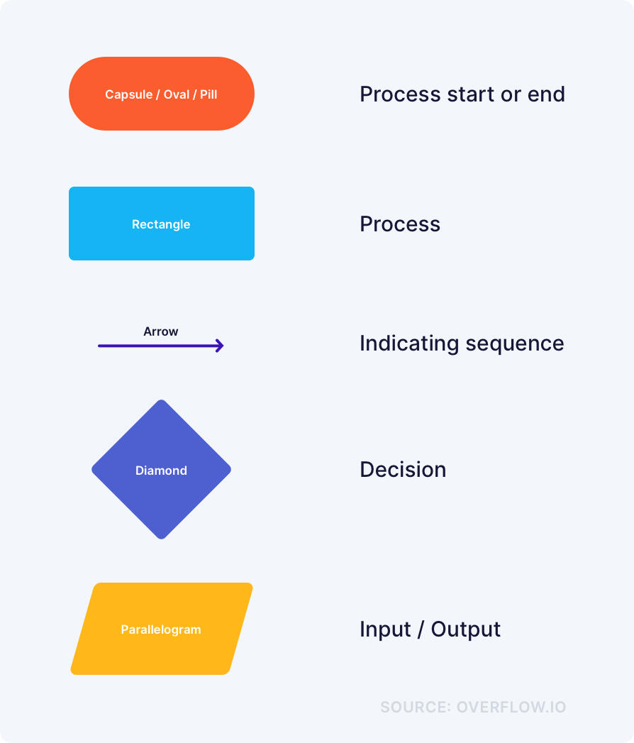
Many other shapes that are not displayed above are rarely applicable in product design-related projects, and can be more often encountered in industrial engineering or computer programming flowcharts.
What are the benefits of flowcharts?
In comparison to user flows, flowcharts are usually quicker to put together, as they do not require much design input, other than choosing colors and labels for each shape. That makes them particularly effective in early product design stages, where teams want to put minimum effort to align on preliminary ideas.
Additionally, flowcharts are easy to create and maintain even by non-designers, so any product manager, marketer, or other member of a scrum team can be responsible for keeping them up to date. Flowcharts can be equally impactful even if they are not designed in digital format — hand sketches on paper can work equally well, depending on the situation.
Lastly, product and design teams can also use flowcharts internally for non-product-related decision-making. As mentioned earlier, a flowchart is the depiction of any type of process or any logical sequence of steps. That means that teams can also adopt them to map, document, or improve their own internal processes, so that they achieve more transparency and alignment.
Similarities of user flows and flowcharts
Possibly the main reason many individuals mix up user flows with flowcharts is the fact that both contain connectors and show a process unfolding from start to finish. In fact, the two have even more, non-visual similarities, related to the goals they help teams achieve and the approach with which they should be created:
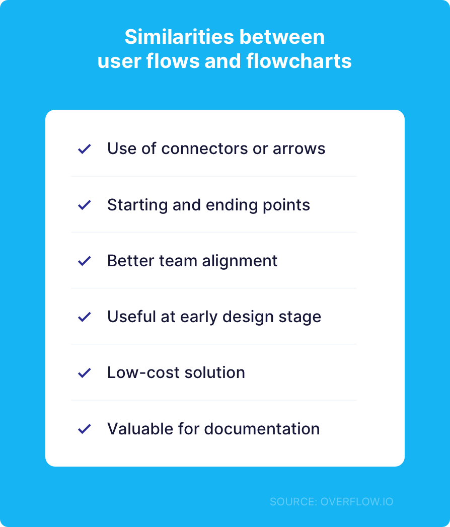
Regardless of their similarities and differences, both types of diagrams can benefit teams immensely and save them significant time during the costly later stages of the product design and development process. Additionally, they help production teams bring all stakeholders up to speed and achieve a smoother project execution with fewer pushbacks and bottlenecks.
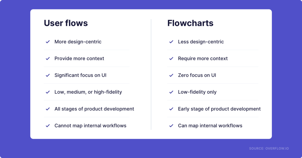
Differences of user flows and flowcharts
As already mentioned, although the two terms are often used interchangeably, user flows and flowcharts are actually not the same thing. The table below outlines the main differences between them from a UX/product design perspective, so it’s easier to choose the one that works best for you at each stage of your process:
Regardless of their similarities and differences, both types of diagrams can benefit teams immensely and save them significant time during the costly later stages of the product design and development process. Additionally, they help production teams bring all stakeholders up to speed and achieve a smoother project execution with fewer pushbacks and bottlenecks.
The perfect hybrid
Diagrams, such as user flows and flowcharts, aim at making presentation and decision-making easier. That also implies that, although there are best practices and rules applicable to each type of diagram, at the end of the day what’s most important is to create personalized documents that serve the intended purpose the best way possible.
There may be times that mixing things up really can convey your message better. Take, for instance, the below variant of the same audiobook app user flow that we discussed earlier:
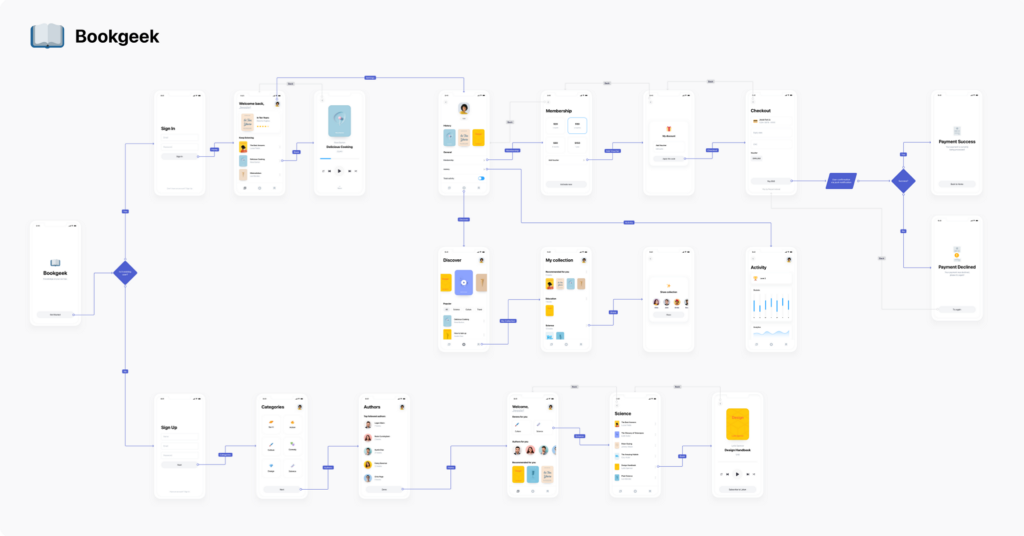
Here, flowcharts symbols were introduced to make the diagram dive deeper into different possible payment outcomes. Since part of the process happens outside the audiobook app, as the user is redirected to their banking app to proceed with the payment, introducing the parallelogram symbolizes this third party user action in a digestible way.
Useful tools to make your life easier
You can build simple user flows with basic prototyping capabilities (screen to screen transitions) on most of the well-known design tools, such as Figma, Sketch, or Adobe XD. However, if user flow diagrams play a big role in your daily workflow and you are looking for an efficient and smooth way to guide your audience through both the big picture and the design details, we recommend trying a specialized diagramming tool instead, such as Overflow.
Overflow also recently introduced the parallelogram and capsule/oval shape, alongside the already existing diamond, rectangle, and circle, thus covering all the flowcharting needs of design and product teams.
For more advanced flowcharting options with more available shapes and symbols, aim for specialized flowcharting tools, such as Lucidchart. If you are a power user of Microsoft Office applications, you’ll find Microsoft Visio a good fit to your existing toolkit.
Are you familiar with user flows, flowcharts, or both? Which ones do you and your team like to use in your internal workflows? Let us know by sharing your thoughts via comment here or on our Twitter, Facebook, or Instagram accounts!
Article written and curated by Constantinos Vitoratos.
Build meaningful design presentations and engage your audience in design critique