As our industry and roles evolve, it is only natural that new trends, needs, and use cases arise. In the design and tech landscape, this is particularly true; I’ve seen it happen countless times in my 20 years of experience, both as a website developer and an entrepreneur. When we founded Protoio Inc. — the company behind Overflow — I was convinced that our mission, would and should be to create tools to solve problems for both design/product teams and managers.
Since we launched Overflow 1.0, we’ve been receiving questions from users trying to build business cases for their whole team to incorporate Overflow in their workflow. Although they know exactly what value Overflow brings to them personally, they need to be able to look at things from a product management or corporate point of view.
Let’s take a closer look at some of the value points and use cases that our team here found while developing and using Overflow internally:
Overflow meets the demand for user flows
Throughout my career, I’ve noticed that innovation is often triggered by a combination of both internal and external stimuli and information. This couldn’t have been closer to the truth during Overflow’s conception.
We started our journey in the design industry by launching Proto.io in 2011, a pioneering prototyping tool with an international user base. We love receiving suggestions from the community and noticed that a lot of users requested that we add user flow creation capabilities to the tool. We did, however, decide that introducing this as a new feature within the existing tool would hinder its value, as Proto.io was already by that time very feature-rich and offered countless prototyping options. We wanted to avoid that users would find the creation of user flows non-intuitive and end up with complicated diagrams, or ‘flowghettis’ as we jokingly dubbed them.

Our stance on why and how prototypes and user flow diagrams serve slightly different purposes has been well-documented. Thus, we decided to develop a stand-alone product, which would respond to the demand and solve specific user problems in a more impactful way.
Back in 2011, we ourselves hadn’t even thought that user flow diagrams could be so useful and impactful. By 2019, however, they are clearly becoming an attention-worthy design industry trend. You (or your boss) may be wondering why — the answer lies in their ability to outline the user journey from beginning to end and illustrate all the different paths a user can take from a specific starting point.
Now imagine a big group of stakeholders that need to make any simple or complex decision on a digital product’s user experience. Well-designed user flow diagrams allow everyone to get the same perspective and be able to contribute on the same basis, simply by following the same presentation. Your boss is also a team member. He is interested to have his opinion heard but also to receive everyone else’s input and expertise, ideally in as few meetings as possible. In our team we use Overflow to simplify this process — I have a feeling it would work for yours too!
Overflow reveals the bigger picture
The product is essentially in the name — Overflow. Let me elaborate with a little fun fact. I am a big drone photography fan — I get inspired every single time I see shots of places from high up. It is that bird’s eye view that gives me a different perspective of my surroundings. Overflow as a name combines the word ‘flow’ (from user flow) with the word ‘over’ (= above, from high up).

Overflow allows anyone to evaluate the user experience in its entirety, moving away from the keyhole view that our eyes naturally tend to focus on. It also allows design teams to get rid of obsolete 50-page PDF documents that were the norm before Overflow to communicate each and every product screen and sub-flow!
Your boss is also a decision-maker. Making decisions can be difficult, especially when you lack the entire picture, or your information is fragmented. By seeing the whole picture and understanding where every step falls in the whole process, any decision-maker can make more informed decisions and feel more confident about the impact these will have on the final result.
Overflow facilitates side-by-side comparison

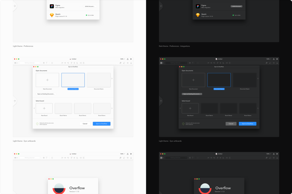
While developing Overflow, our team took a very hands-on approach. We saw the benefit of using our own tool to develop future versions of itself — I can’t help but get “Inception” vibes every time I think about it! We used the Alpha version to develop the Beta, the light mode to create the dark, etc. Overflow always made it possible to make side-by-side comparisons, as well as to evaluate different scenarios, modes, and versions that we had in mind, simply by presenting them one below the other or as different boards in the same share link.
What’s more important though is that, eventually, we were always able to make the final decision knowing that we had picked the best option from the ones on the table at the time. And this was always a huge relief for me as a co-founder. At the end of the day, your boss is also an employee, who wants to reach their daily goals in the safest and most hassle-free way possible.
Overflow saves resources at the ideation stage
We’ve all been there: sitting in meeting after meeting for weeks, involving all stakeholders, producing hours work, only to see it all go to waste because the initial direction was not right. In the past, our team also made this mistake more times than I’d like to admit. Nevertheless, we are making an active effort to practice what we preach — while developing productivity solutions for our users we also try to put them in good use internally.
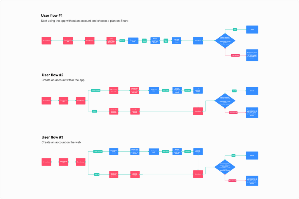
While developing the billing system for Overflow 1.0, we barely knew what beast we were up against: hundreds of user scenarios related to a sensitive process including money, which can easily cause frustration to any user. For that reason, we decided to start simple and allocate more resources as we became more aware of potential issues and complexities. First, we created Overflow diagrams with simple boxes symbolizing individual steps a user would need to take to reach a desired outcome. This mapping of sorts allowed us to identify pitfalls and branching of user behaviors that could impact their overall experience. Once we got a more holistic idea, we started replacing the boxes with wireframes, thus creating wireflows. Only after this was done we started actively involving our design and development resources to the mix.

Your boss is also a resource manager. They need to always prioritize and allocate work resources wisely to avoid wastage. I’ve seen Overflow help our team come closer to achieving this goal, so I am confident your team can benefit from it as well.
Overflow helps add value to your existing products
Have you ever considered what happens with digital products that have been developed and updated multiple times throughout the years? You are right, many of them end up becoming more complex and chaotic with every single new release. Such products are at higher risk of never getting a proper UX review and, thus, becoming obsolete. This issue becomes more pressing in companies with a wide portfolio of digital products, where putting attention and resources on just one may sound like a huge hassle for everyone involved.

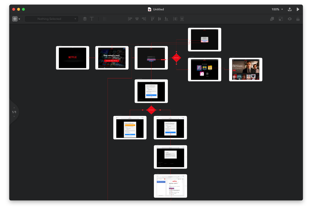
As mentioned earlier, our first tool Proto.io was first brought to market in 2011. Since then, we have released 6 new versions and multiple updates. When Overflow became a reality, we started wondering how we could use it to improve Proto.io’s existing UX and make it more friendly to the average user. Since Overflow makes it easy to create user flow diagrams from imported designs, we thought we could use Proto.io screenshots and add connectors to it, in order to map the existing user experience, evaluate it from a bird’s eye view and see where we could make improvements.
Overflow has as many use cases as its users can come up with
Next time you find yourself in a position where you have to explain to your boss why your team needs Overflow to improve your daily workflow, I hope some of the above examples come to mind. This list is not exhaustive — these were some of Overflow’s use cases that we tested and found work for us. It is highly likely that you also come up with something new that we haven’t even thought of, as your workflow and needs are unique. After all, innovation is often triggered by a combination of both internal and external stimuli and information. And I am pretty sure your boss likes innovation 😉
Build meaningful design presentations and engage your audience in design critique