How to improve the design storytelling process with user flows
Vasilis Odysseos in Overflow Storybook

It has been the convention, until recently, for designers to communicate their work to an audience by displaying static images and verbally explaining the reasoning behind including each UI component, and justify the decisions they made in general. This method has always been ineffective, as using disconnected images does not present a clear picture of how the user will navigate the product, so designers, developers, and stakeholders end up having a different idea of what the user flow is. When there is not enough time to ensure that everyone is on the same page, misconceptions about the final product are created, which will undoubtedly cause issues later on in the development process.
Interactive prototyping tools can help relieve this painpoint to some extent, by allowing us to add interactions to UI components, so it becomes easier to understand the functionality of the app or website. However, interactive prototypes only allow us to see a confined view of the user’s experience. They are restricted to a single path they might take and don’t show the bigger picture, so we can’t see the user flow. In interactive prototyping, we are on a certain screen and can ask “where can the user go from here?” In user flow diagrams, we can point to any screen and also ask “how can the user get here?” User flows are ideal for easy iteration until we find the perfect flows for our personas, but we still need prototypes to test these flows with actual users and fine tune our designs.
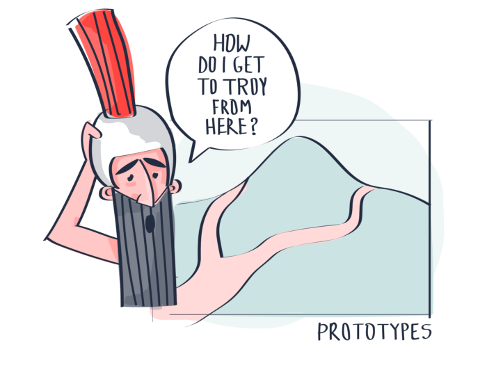
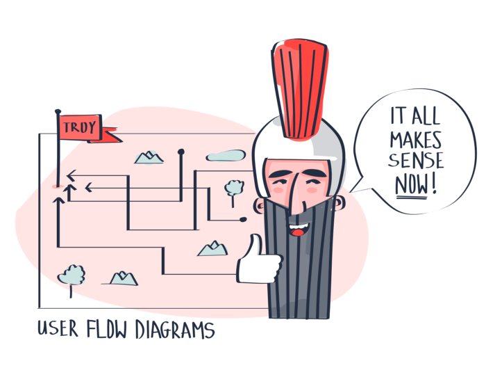
Prototypes answer the question: “Where does the user go from here?” User flow diagrams also give us the answer to: “How can the user get here?”
What is a user flow?
In simplest terms, a user flow is the path taken by a user of a digital product to complete a certain task. User flow diagrams give us a visual representation of all paths at once.
Why do user flow diagrams matter to us?
They matter because we can design every step of the flow with the user’s intentions and expectations in mind, creating the simplest way for them to complete a task. Through user flow diagrams we can explore multiple personas as well as different entry points and examine each use case. This means we can better understand our users so that we can optimize our product to drive engagement.
Static images, prototypes, and user flow diagrams all help, in their way, to facilitate communication between both design and product team members. However, the heavy lifting here falls on us, because we need to present our designs in a way that is memorable and interesting. Doing that can often be a great feat. Our coworkers’ busy schedules and busy minds hinder their ability to concentrate on presentations so that they can provide valuable feedback. They will also tend to forget what was said almost immediately after leaving the room. Our solution to this is viewing the user’s path as a story and presenting user flow diagrams as their journey.
The art of telling a story
For millennia, storytellers have given their audience an escape from their everyday troubles, if only for a short time, by immersing them in worlds they never imagined, learning about the adventures of legendary heroes. Aesop sought to educate the people by disguising important life lessons into fun stories using animals as his main characters. Homer recounted the epic tales of Achilles and Odysseus, during and after the Trojan War, which still leave audiences captivated to this day. Bards sang tales of fabled warriors, in taverns and inns, through the ages.
Aesop and Homer shared their stories through word of mouth, while bards used music to entertain their audience. Today, we read stories in books or watch them on television and in theaters. This teaches us that stories transcend medium and that if a story is good, it can be told through any medium. So, our medium, user flow diagrams, is just as great a tool as pen and paper or a camera. Storytelling through user flow diagrams can surely give us the ability to captivate our audience and give better presentations than putting static images on a screen.
The 3 components of a story
A successful story only requires three parts. Our shaping of those parts is what determines the effect of the story on our audience.
The Hero
The first component is the main character. The majority of classic tales follow the journey of a hero on their adventures. The main character has to be someone that the audience can empathize with so that they become engaged in the hero’s story. The trials and tribulations the character goes through must resonate with the audience, causing them to be in the same emotional state as the character.
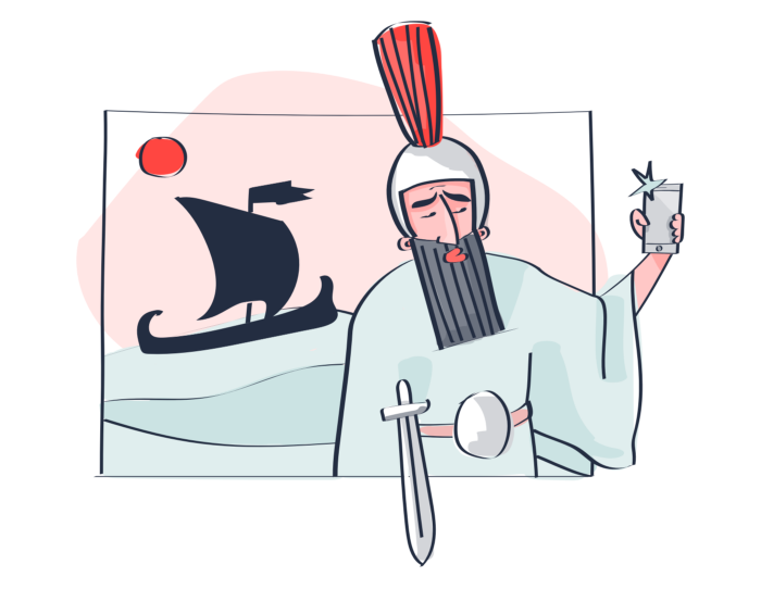
In user flow diagramming, the hero is the end user or the persona. This could also be you, or anyone of your coworkers. The problems the user is facing — and that we are trying to solve by creating our product — may be the same problems that we face. Even if we don’t share the same painpoints as our user, having a story and a hero allows us to relate to the user so we can think critically about how to help them.
The Scene
The second component is the scene. Building a great scene is as important as creating the character because having a well-developed character in a scene that isn’t lively hinders our ability to immerse our audience into the world we are creating. If our scene is realistic, the audience will forget their present location and transport themselves into the world we are creating.
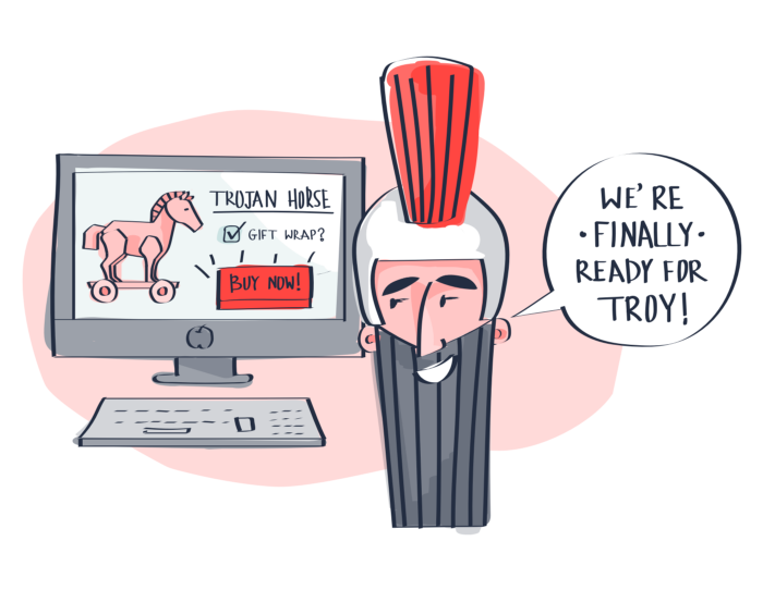
For us, the scenes we create are the different subflows of our app or website, for example, a scene could be the checkout process of our shopping app. Giving more detail to our designs will allow our audience to feel like they are actually using the product while testing the subflow, rather than viewing static images. This creates a stronger connection between the audience and our narrative.
The Plot
The third and final component is the plot. The plot consists of three parts: the beginning, the middle, and the end — very complicated, I know. This may sound simple, but the structure of our narrative needs to be precise, as it is the journey the hero takes and is what defines our story. In the beginning, the hero receives a call to action where they embark on their journey. Often in movies, they have to save someone they care about from danger. The middle is the hero’s journey, where they are faced with adverse circumstances and many dangers during their mission, but ultimately succeed and better themselves in the process. The end, or resolution, returns our character back to the beginning, having completed their duty but fundamentally changed by the things they encountered along the way.
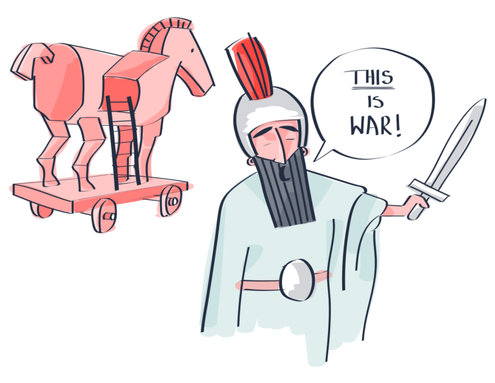
Our plot is the user flow. Our user needs to complete a task, and they embark on the journey of using our product to do that. Along the way, the user must familiarize themself with the product, and learn how to use it in order to reach the end. By following the plot, we can see the troubles the user might face, and work on our designs to make their adventure easier. Having completed the task, our user must feel satisfied that they met their objective. Our product needs to fundamentally change their experience with this problem so far.
Using this structure, we can implement our user flows into diagrams which tell the story of our user. This will ultimately allow us to understand our user by analyzing their journey through our product, just as we would analyze a book or a film.
Communicate better
At the end of the day, when we create and iterate on user flow diagrams, our main drive is to create amazing products. To do that, we need better communication between team members. We want to avoid misunderstandings — which are a massive waste of our time — when presenting and sharing designs. A story will always be easier to comprehend, remember, and most importantly, empathize with than the verbal explanation of individual images during a presentation, allowing for a streamlined and comprehensive design process.
Where Overflow comes in
Overflow is the ideal tool for presenting user flows as stories due to its unique feature set. We can easily follow the plot because it enables us to view all screens at once or zoom in to focus on a single screen when needed. The ability to add interactive layers allows us to directly interact with the designs, which can give us a sense of engagement and involvement, putting us in the user’s shoes and enhancing our story’s relatability and effectiveness.
Build meaningful design presentations and engage your audience in design critique