Presenting your designs with Sketch + Overflow vs. Sketch alone
Overflow Team in Overflow Storybook

Is Overflow a Sketch alternative?
People often ask us on social media or while visiting our booth at events worldwide if Overflow is better than Sketch for design presentation purposes. Some are confident that Sketch is all they need to move from early design ideation to developer hand-off.
The answer greatly depends on each team’s desired collaboration and communication model. We always say we don’t consider Overflow a Sketch alternative or vice versa. Bearing that in mind, we’d instead list the many reasons that make Overflow + Sketch the ideal workflow solution for teams like yours that always put design in the forefront.
Designing is a different process from presenting.
Sketch is a powerful tool traditionally focused on perfecting the actual design process. It has relied on a rich network of plugins to extend its functionality to other areas of product design, including design presentation and feedback. Building professional looking-presentations can be a rather tedious process if one depends on Sketch’s capabilities alone and removes all plugins from the picture.
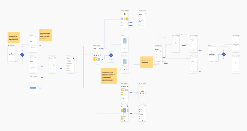
To test this, our in-house designer created a user flow presentation in Sketch from scratch:

Although very professional-looking, this presentation was quite a hassle to produce. Quoting the designer who worked on it:
- The whole process (excl. designing the screens) took about 3 hours.
- Most of the time was spent creating and styling connectors manually from scratch.
- Connectors are just line shapes, they don’t connect the start and end layers.
- Connector labels are rectangles that were turned into symbols for reusability.
- Making decision trees requires workarounds, and hiding the screen around them is impossible.
- Notes are simply shapes resembling post-its, making the design look messier.
When showcasing visual work synchronously or asynchronously, it’s very important that the audience remains engaged throughout the process and can get the most out of our presentation. The main problem with the above exercise’s output is that it lacks any interactivity or playability option when viewing the project from a bird’s eye view. Users need to switch to the prototype mode to interact with the screens and feel engaged.

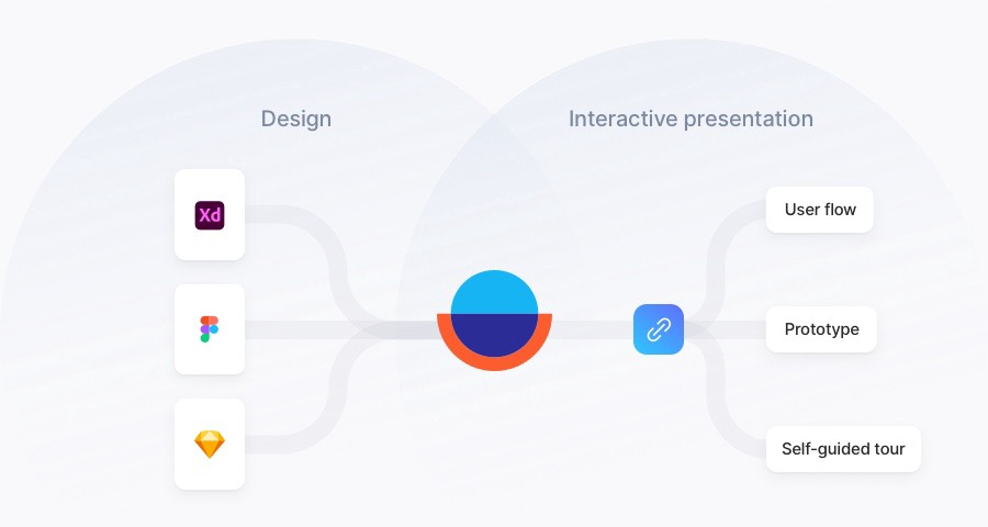
As a tool built specifically for design presentation purposes, Overflow is the other half missing from your existing Sketch workflow:
✅ Bring together creatives from both Sketch and other tools
✅Create playable, interactive user flows in 30’ or less
✅ Navigate through your canvas using your mouse or keyboard arrows
✅ Switch between three presentation formats: canvas view, prototype view, step-by-step walkthrough
✅ Get an automatically-generated rapid prototype for each Overflow document
✅ Add titles, annotations, and shapes without spoiling your design canvas
The “no-meeting” design critique approach
Design document share links lack essential structure and context, making them virtually impossible for any audience to digest without onboarding meetings and long explainer emails. As a result, the currently popularized design critique process contributes to meeting fatigue and miscommunication rather than eliminating them. With remote work becoming the new norm, time zone differences can make communication logistics even harder.
Overflow Stories offers an easy, viable solution to these common issues. By allowing designers to create self-guided design walkthroughs, it provides the audience with all the necessary structure and context to conduct design critique at their own pace.
To illustrate this point, our designer recreated the same presentation from earlier inside Overflow. Simply use the arrow keys and… follow the story!
Many teams need help introducing asynchronous communication practices to their workflow. Overflow makes asynchronous design critique a feasible reality for Sketch users by allowing them to narrate design stories effectively without presenting themselves.
Sketch + Overflow: A match made in heaven
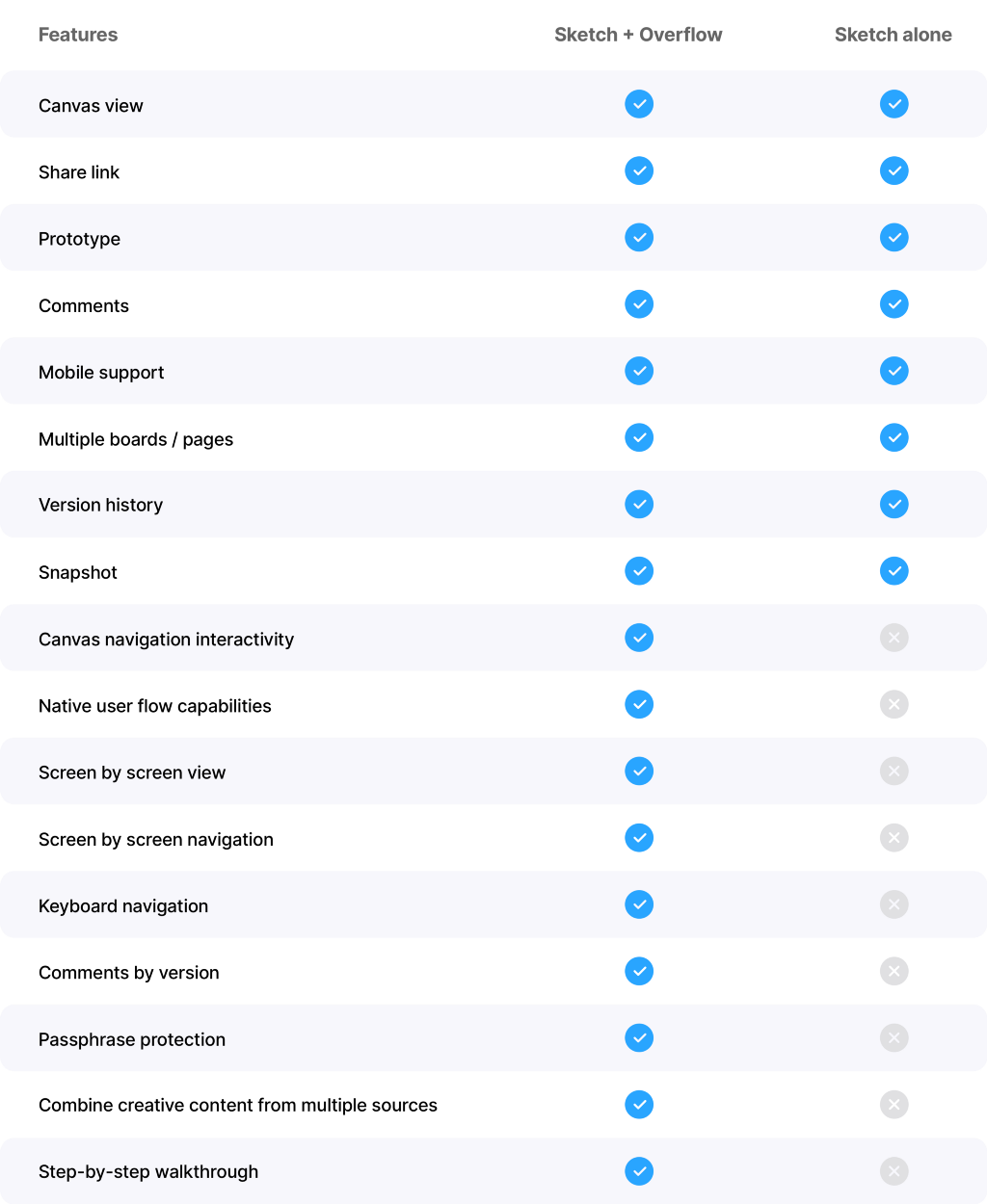
As powerful as Sketch may already be feature-wise, it still needs critical design presentation features that Overflow can quickly bring to the mix. Here’s an extended list of features that every design team needs, proving how Overflow is the perfect Sketch companion:

Settling for lesser solutions is the perfect way to attract potential communication gaps, bottlenecks, and disappointment. Overflow alongside Sketch makes for the best recipe for a clean, engaging presentation experience with minimum effort and time investment.
Our designers use this combination of Overflow and Sketch daily to avoid tedious tasks and direct their focus on creativity. They did not just notice a boost in their productive output but have also started receiving better, more actionable feedback from the rest of the team, including product owners, marketers, and developers.
Download Overflow and start your 14-day full-feature free trial today!
Other useful links: Inserting screens from Sketch | 7 reasons you should present in Overflow
Build meaningful design presentations and engage your audience in design critique