The Overflow solution to 4 common designer nightmares
Aimilia Tzanavari in Overflow Storybook

As a product team in a tech startup, we know a few things about nightmares. While developing our first product, Proto.io, in 2011 we often faced design communication, resource, and time-constraint problems and looked for creative ways to solve them. After carrying out some user research and talking to friends at other startups, we came to the conclusion that our nightmares were in fact shared by many other product and design teams in the industry.
We narrowed down the problem and realized that the ineffective way design solutions were expressed, communicated and critiqued on, resulted in unnecessary loops and wasted resources. When this pattern repeats itself often, it feels indeed like a nightmare. Although we had a prototyping platform that enabled us to wireframe, prototype, and test solutions, it felt like an element was missing. And we had to find it. That missing element was the story behind the proposed design solution: a way to visualize and communicate the user’s flow, path, journey. What steps would they follow to achieve a particular objective? Are there alternatives? How is solution A better than solution B? The questions list was big, but we felt confident we had the answer.
In this challenge we were in an advantageous position: we also felt the pain points and so we could validate any solution ourselves (on top of user testing of course). We designed Overflow to be a simple tool to give an effective solution to a very specific problem: user flow diagramming for designers.
Here’s a quick look at some of the nightmares product and design teams experience in their workflow and how we think Overflow can help deal with them:
Nightmare 1: Collaborating with Developers
This is where it all started for us — and maybe it did for you too. “Back-and-forth” seems to often describe in a nutshell the collaboration between designers and developers. It’s not uncommon for developers to require more context or clarifications around a design that they received. They often find it difficult to visualize how an app will work in its entirety, simply by receiving designs that might initially seem loosely linked to each other. If we add different user paths and personas to the mix, the struggle becomes real!

In attempting to solve this hurdle, designers sometimes hand over a prototype, so that developers can experience the user journey for themselves. This can be frustrating because now the developer will need to go through the entire journey to understand “what leads where.” While prototypes can be a solution for communicating details such as animations, transitions or micro-interactions, they are not the optimal way to communicate all possible paths a user might take and they can rarely cover all possible user personas.
The Overflow Answer
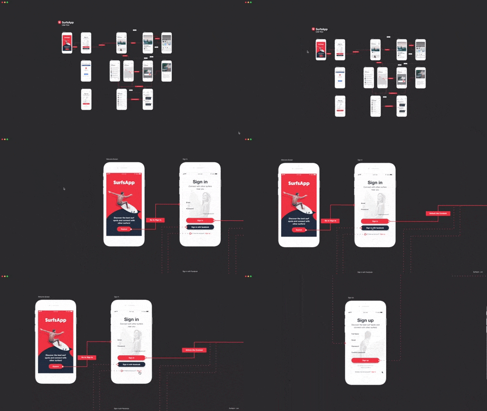
With Overflow, all the designer has to do is hand the developer their designs, along with a user flow diagram that gives a bird’s-eye view of the entire app or specific part of the app. This way developers have the complete picture and know “what leads where”, easing communication between the two parties.
Nightmare 2: It Takes Time and Effort to Create User Flow Diagrams
Well, at least it used to. These diagrams were a pain to create, update and share. As a result, there would be times when designers were tempted to simply skip the entire process (and frankly, who can blame them). Plus, user flow diagrams needed to be made with general-purpose flowcharting tools, which not only meant they weren’t tailored for designers but also required designers to learn an entirely new tool that didn’t really help with design in any way. And, after all this effort, all you could do was build diagrams with exported PNGs of your designs and then manually update them, going back and forth between tools. Definitely a nightmare!

Here’s What We Did with Overflow
Overflow allows you to build user flow diagrams in a fraction of the time you would normally take. In fact, you can start from early-stage diagrams, easily and quickly updating them with the latest designs, as the project progresses. The best part is that Overflow integrates with popular design tools, such as Adobe XD, Sketch and Figma, allowing you to bring multiple designs into Overflow within seconds and build flows with ease. And here’s something every designer is going to love — updating the diagrams with newer designs is simple and quick, keeping all connectors intact, without the designer having to redo anything. If that isn’t getting close enough to design Nirvana for you, then keep reading…
Nightmare 3: Communicating with Stakeholders
Traditionally, designers presented static user flow diagrams or even massive multi-page PDFs to stakeholders. These 2D representations are extremely difficult for clients, who are not usually tech-savvy, to understand. If the stakeholder feels lost during the presentation of the user flow, they might worry about the direction the product is taking and whether the concept being developed will solve the problem they set out to solve, or even whether it actually fulfills their expectations. In short, everyone might not be on the same page, increasing the risk of irrelevant and unhelpful feedback.
Overflow adds Interactivity
You don’t need to be a tech geek to understand the interactive user flow diagrams created with Overflow. Stakeholders can easily zoom in from the big picture of the entire user flow to specific details of the user’s journey. They can even interact with various screen elements or discover a specific user path for themselves. All in all, it allows stakeholders to provide better constructive feedback.

Nightmare 4: Extra Work to Build a Rapid Prototype
Here’s another hurdle we’ve battled with for years. Traditionally, designers needed to first build user flow diagrams and then use another tool to create a clickable prototype. Remember, the first was static and the second interactive, so you needed the rapid prototype to get a closer-to-real experience. Using a different tool for building a clickable prototype took extra time — and time is precious for designers.
The One-Stop Solution
What we wanted to do was to allow designers to simply create their diagram in Overflow and automatically get a clickable prototype. Honestly, you already drew connectors to represent how users navigate the app, why need to do it again? That’s why Overflow offers two presentation modes — interactive presentation, with the whole flow view, and rapid prototype, offering a screen-by-screen view. This is also possible while previewing an Overflow Share on the Overflow Web or Mobile player. What we especially like is that previewing the rapid prototype on a mobile device can actually give the viewer the desired experience. This way everybody, including stakeholders, is in the best possible position to make informed decisions.

Nirvana
We’re sure you could relate to the nightmares described above, as they’re so commonly faced. Overflow is the tool that can take designers from a nightmare to a nirvana state. No more suffering from the nightmares of excruciating diagramming, ill communication, and costly iterations. Overflow is here to make designers’ lives easier and allow them to spend time on more important things and not worry about the difficulties in creating or communicating user flows. Its mission is to support product teams throughout the design process, helping them increase their efficiency and build products that make a difference.
Thanks for reading! If you have any suggestions or feedback, Ι’d love to hear from you. You can send me an email at aimiliat@overflow.io. I’m also pretty active on Overflow’s Slack channel.
P.S. You can follow Overflow on Twitter and Facebook for Overflow Tips and Tricks.
Build meaningful design presentations and engage your audience in design critique