7 reasons why you should present your design work in Overflow and not in your design tool
Overflow Team in Overflow Storybook

One of the latest big trends in the design industry is the search for a “one tool fits all” solution. From prototyping ideas to presenting and handing off work to developers, designers are looking for one tool that can help them tackle all of their daily tasks. Naturally, as the average designer spends significant time designing, their design tool is considered an obvious candidate.
Specifically, when it comes to design presentation and getting stakeholder feedback, designers often depend on the basic prototyping features introduced by design tools. In scenarios, where these features don’t exactly get the job done, they have to get inventive or spend much extra time to prepare something presentable — sometimes both.
In this article, we are highlighting 7 reasons why you should walk the extra mile when building and delivering engaging design presentations and how Overflow can help you streamline your process and save significant effort.
1. Organize work for presenting, not designing
A design tool canvas is by default built to facilitate designing over presenting. Like with a traditional painting, a design canvas can be messy while the creative process is ongoing. But even when it’s over, critical features are missing to communicate the bigger picture without spending extra time to significantly rearrange work for presentation purposes.
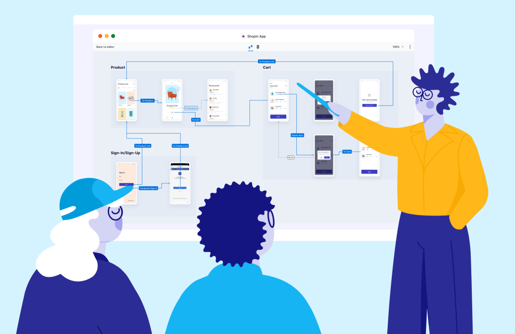
Overflow is ideal for putting together design presentations as it lets you rearrange your screens in a way that makes sense for sharing and getting feedback. Its infinite canvas and multiple boards allow designers to map the user journey in a way that unwraps the bigger picture for stakeholders.
Additionally, Overflow allows you to add visual cues to enhance your presentation, such as copy, logos, or other visuals, something that is trickier to do in design tools due to their artboard-based approach. What’s even better? Your original design files remain unaffected and can be as tidy or messy as you want them to be to maximize your productivity.
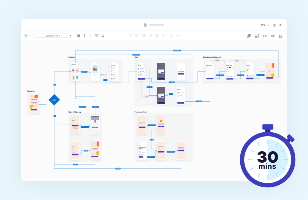
2. Create professional user flows in 30’ or less
Think about the last time you put together a user flow inside your design tool. How long did it take you to add annotation and branding elements to your diagram? Were you able to easily style your connectors? What about editing and fitting device skins around your artboards?

Overflow was created primarily for user flow diagramming. It comprises powerful features that help you streamline the whole process and significantly cut down on the time spent on repetitive, manual tasks. That means you can get a presentable, professional-looking result and ace your next design presentation with minimum effort and in no time.
3. Minimize discussion sidetracking
One of the most common issues designers face while presenting, is stakeholders or clients asking for changes on the fly. Try this color instead… Make the size smaller… Move this a few pixels to the left… we’ve all been there. Once a meeting gets sidetracked it’s hard to claim everyone’s attention back — and presenting right inside your design tool is like asking for trouble.
Made specifically for design communication purposes, Overflow helps you engage your audience with a playable user flow diagram that is hard to ignore. Additionally, being away from your design tool’s interface takes away a big part of the expectation that changes can be applied on the spot.
4. Build presentations from multiple sources
There are cases where people design using one tool at home and another in the office, or prefer different tools for different types of design tasks. Another scenario is when some project assets are image files saved locally or come in the form of product screenshots. In such cases, deciding on a presentation format and bringing together output from different sources into one canvas can be a painful process.

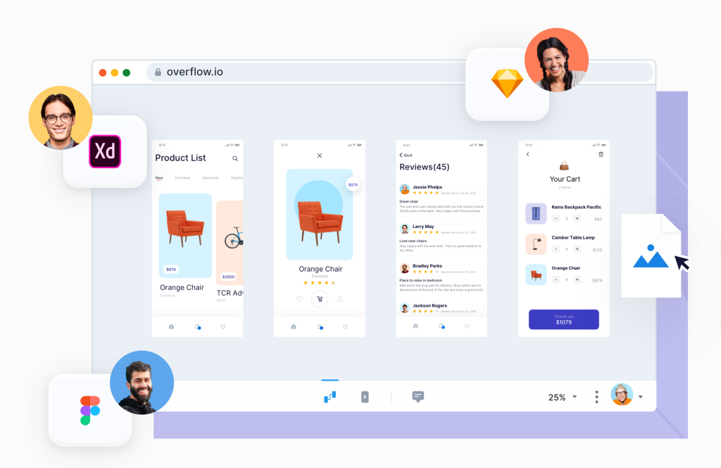
Overflow makes it easy to bridge content from different sources into one canvas, without messing with your original design files. It allows you not only to sync your designs from Figma, Sketch, Adobe XD, and Photoshop, but also to upload image files to which you can then add hotspots. That way, you can connect all types of visuals or screens to one another and make them organic parts of your design presentation experience.
5. Push changes with zero hassle
Iterations are an integral part of the design process. Each time you apply changes to your designs you should be able to focus on just that — worrying about how it might affect your presentation is counterproductive. When presenting inside your design tool this worry is unavoidable, simply because each design change you apply implies a lot of manual work for that change to be reflected in your presentation.
Updating your design presentation with the latest changes in Overflow couldn’t be easier. Simply hit one button to re-sync your designs from the original design tool; all of your connectors remain intact and automatically adapt to the new positioning of each design layer.
6. Guide your audience like a maestro
Presenting inside a design tool is mostly limited to a simple screen-to-screen click-through prototype. For the bigger picture, designers resort to manually designing flow diagrams to export as PDF files or print to stick on a wall. Obviously, these traditional methods make switching from the design details to a bird’s eye view virtually impossible.

Presenting in Overflow is an immersive experience, assisted by functional keyboard shortcuts that allow you to navigate, zoom, and move between sub-flows and boards organically. A beautiful animation complements jumping from one screen to the other, while switching between Overflow’s two presentation modes — flow mode and rapid prototype — puts things into perspective and allows you to see the bigger picture, while still being able to focus on design details when necessary.
7. Explore different versions with ease
Designers often need to showcase different versions of the same design or walk the audience through the progress timeline of their work. In traditional design tools, this can only be achieved by placing different versions side by side on the same canvas or by creating a separate design file for each version. Needless to say, none of these allow the audience to follow the presentation and focus on what changed, without an extra effort on the presenter’s side.
Overflow allows designers to add an infinite number of boards to their presentation files and easily switch between them with a convenient keyboard shortcut for a smoother design presentation experience. That way, each board contains one version and the whole presentation file remains clean and easy to maintain in case further changes occur. Comments left by stakeholders can be accessed for all or specific publication versions, making it easier to collaborate or iterate accordingly.
Did you try presenting in Overflow after doing so in your design tool for some time? How did your experience improve?
To constantly improve, we are always interested in hearing your thoughts. Leave us a comment in the comments section below, or feel free to tag @overflowapp on Twitter, Facebook, and Instagram.
Article written and curated by Constantinos Vitoratos.
Build meaningful design presentations and engage your audience in design critique