User flow vs wireframe: Two terms that you might be using wrong
Overflow Team in Overflow Storybook

As a team that has been working extensively within the UX/UI design landscape for over two decades we talk daily to many designers, product owners, and creative directors. One thing we couldn’t help but notice was that often people refer to the early user flows they put together for internal design review or early client onboarding meetings as ‘wireframes’.
Wireframes existed in visual, web, and product design essentially since the three disciplines took their current form and name. User flows, on the other hand, first appeared as a recognizable design term sometime in the 2010s, as a result of the bigger importance that design thinking received within major tech and other corporations.
In this article we’ll try to shed more light on what each of these two popular terms exactly means, as well as identify their main similarities and differences, so that they are easily distinguishable from one another.
What is a user flow?
A user flow is a visual depiction of all the alternative paths a user can take to reach a certain goal. User flows can be of low, mid, or high fidelity, each recommended for a different stage of the product design process.
The early stage, also known as the ideation stage, is when design teams benefit most from low fidelity diagrams comprising shapes, annotations and connectors. Once the design process officially begins, medium and high fidelity flows start being introduced. Contrary to their earlier counterparts, these user flows contain more advanced visuals, device skins, branding and other elements that showcase the intended visual experience of the end user more clearly.
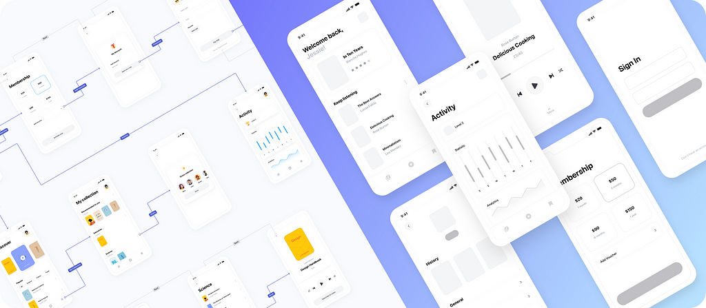
Let’s take as an example the above user flow diagram of an audiobook app. After logging in, the user’s main goal is to listen to an audiobook of their liking. They can reach that outcome in multiple ways depending on various parameters, such as their registration or membership status. User flows essentially visualize all these possible scenarios in a concise, digestible format.
What is a wireframe?
A wireframe is the early layout of an app or website screen, comprising rectangles, placeholders for image, text, and buttons, as well as all other elements indicating the intended direction of the final product’s user interface (UI). Wireframing is an integral part of the interaction design process, as it establishes a basic page structure before final visuals and content are produced and added.
Although in the greater context of design all wireframes are considered to be low fidelity artifacts, there are wireframes like the one shown above that are more detailed than others and require more time and effort to produce. For instance, a low fidelity wireframe can be completely hand-drawn with personal notes on the side, whereas a high fidelity one is fully digitalized, often including icons, components, or even buttons with the product’s brand colors.
Similarities of user flows and wireframes
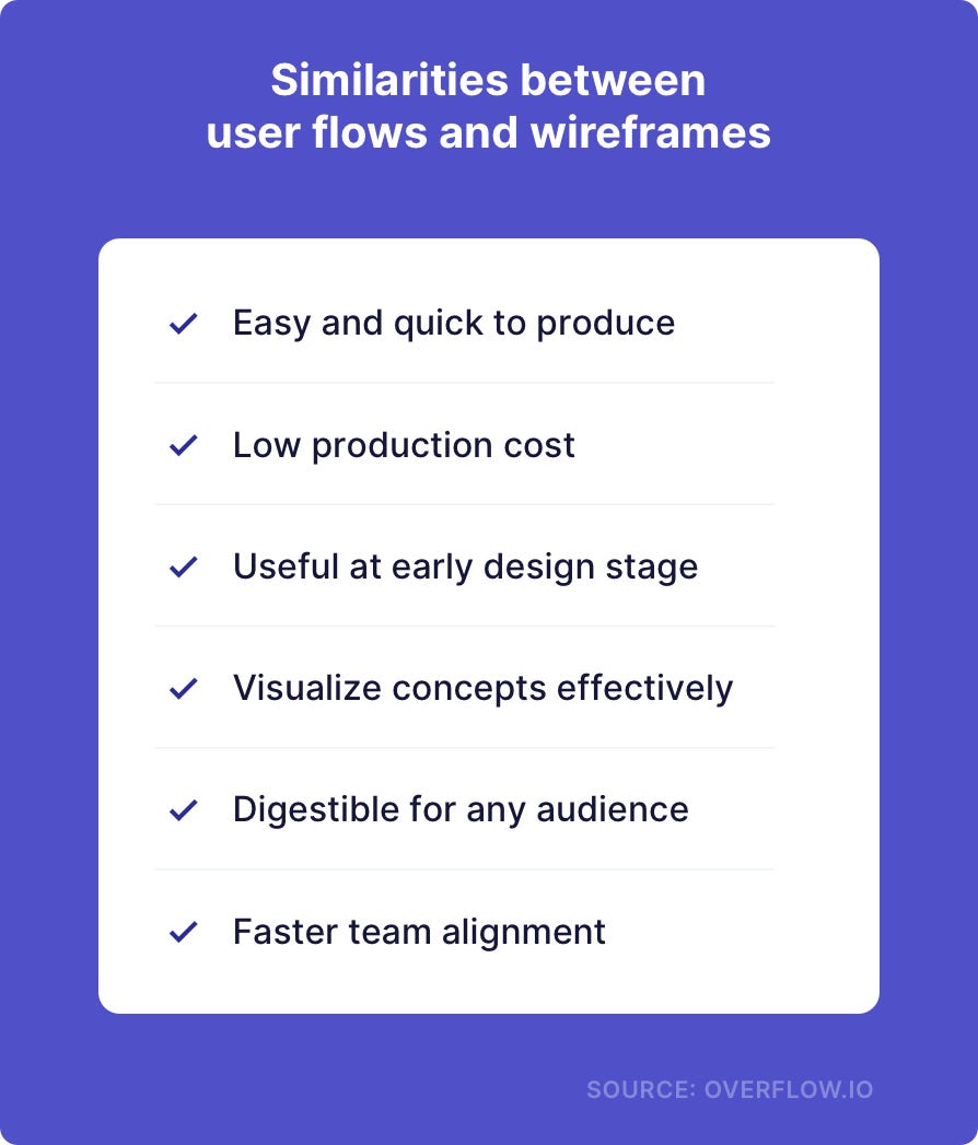
Probably one of the main reasons why people mistakenly use these two terms interchangeably is because of the many shared benefits they offer to UX/UI designers and product teams:

Both wireframes and user flows offer an economical way to get the team’s creative juices flowing and achieve team alignment at an early stage, thus their popularity in the industry. Due to their visual and simple nature, they both are ideal for any type of presentation and audience, regardless of design background or prior experience with product development.
Differences between user flows and wireframes
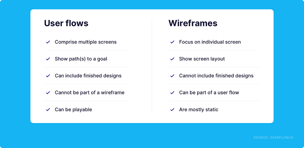
User flows and wireframes are two completely different design artifacts, mostly when it comes to their appearance. We’re outlining their main differences below:

Essentially a user flow is a more complex design document than a wireframe and it can stand alone as a design presentation. Specialized user flow diagramming tools, such as Overflow, allow users to produce playable, interactive diagrams that the presenter or the audience can play around with by clicking on connectors.
Wireframes, on the other hand, are both static and not necessarily self-explanatory; they often need to be accompanied by a live presentation or at least some creator’s notes to make sense to the audience. Medium fidelity user flows are called wireflows and comprise multiple screen wireframes.
Where can I create user flows and wireframes?
You can create non-interactive user flow diagrams with basic screen-to-screen transitions in any of the biggest design tools, such as Figma or Sketch. However, if user flows are something you and your team are expected to produce, present, or document on a weekly basis, it’s recommended to vouch for a specialized diagramming tool, such as Overflow.
Overflow can help you prepare low- and high-fidelity user flows and split your more complex flows into different boards for easier documentation or presentation purposes. Our recommendation is to present each sub-flow on a different board and interlink the boards between them to move around simply by clicking.
When it comes to building wireframes the options are many more. One popular approach is to build wireframes that are also directly presentable within prototyping tools, such as Proto.io or similar. Alternatively, if you don’t want to invest time and money in a new tool, you can design wireframes in your existing design tool of choice. Finally, if you feel unconfident in your design skills, the best way to go about wireframing is the good old sketch on paper. No matter which approach you go for, make sure the wireframe is not messy and contains side notes or any other context your audience might need to make sense of it.
Are you familiar with user flows, wireframes, or both? Which ones do you and your team like to use in your internal workflows? Let us know by sharing your thoughts via comment here or on our Twitter, Instagram, or TikTok accounts!
Article written and curated by Constantinos Vitoratos.
Build meaningful design presentations and engage your audience in design critique