User flow VS user journey: Similarities & differences of two UX design essentials
Overflow Team in Overflow Storybook
With UX design constantly evolving to adapt to new trends, as well as user needs, there’s often a lot of confusion around different tools and processes that become available to designers. User flow diagrams and user journey maps are two such terms. Although they are used interchangeably by some, in reality they are significantly different both in terms of approach, as well as scope.
This article outlines the main similarities and differences between these two popular UX processes, so that you can choose the one that works best for you, based on where you currently are in the product design process.
What is a user flow?
In simple words, a user flow is the visual representation of the path(s) a user can take, in order to achieve a specific goal. In their most basic form, user flow diagrams combine visuals (screens, shapes, or images) with connectors, in order to define the sequence of steps towards the desired outcome. More complex or presentation-ready user flow diagrams can comprise extra elements, such as labels, device skins, branding details, etc.
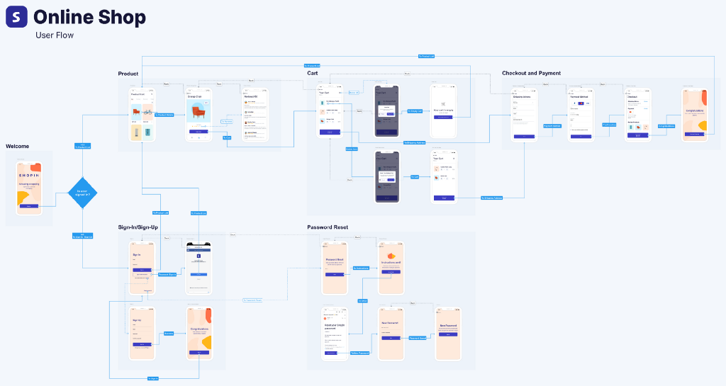
Let’s take as an example the above user flow diagram of an online retail app. Upon logging in, the end goal of the user is to be able to buy products by completing the payment and ordering process. They can do so in more than one way, depending on different factors, such as if they already have an account or not, if they are signing in via email or Facebook, and so on. User flows take all those scenarios into consideration and showcase different paths to success in a digestible, easy to follow way.
What are the benefits of user flows?
User flow diagrams are a great way to focus on the UI of each individual screen that comprises a website, app, or digital experience. That makes presenting easier for UI designers, while also allowing for more targeted feedback from stakeholders. User flows are visually engaging and, if built right, they follow a logical path that any audience can keep up with with no difficulty, even without much prior knowledge of a project’s whereabouts.
Additionally, user flows are often credited with bridging the gap between designers and developers in a quick and easy way. A handoff that normally requires a couple of meetings and might lead to miscommunications can be condensed in a visual format that leaves very little room for misunderstanding. Our tip is to always make sure all screens are properly annotated and all connectors have labels to give your developer some much needed context.
What is a user journey?
A user journey (also known as a user journey map) is the visualization of the user experience of a specific product or service through a longer period of time and throughout multiple channels. Rather than being just an outline of steps or actions, however, user journey maps also heavily focus on the user’s feelings, benefits, and losses throughout the whole experience. For that reason, user input is essential beforehand, in the form of interviews, panels, or other feedback-collecting processes.
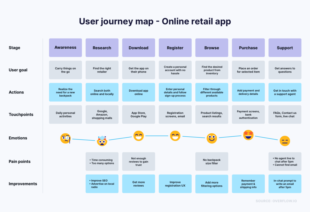
Another interesting thing about user journeys is that their starting point is usually not the moment a user first interacts with the product in question. The mapping process already starts from the realization of a need or problem that the user wants to solve by using that specific product. SImilarly, the ending point is not when the user stops utilizing the product but, rather, when they leave reviews, spread the word, or leave a complaint.
What are the benefits of user journeys?
User journeys are more human-centric by nature. They are a great way to understand the average user and empathize with them, by understanding their deeper motivations, desires, and fears. That way, the team can make product decisions that are more likely to provide a positive experience and create a long-term dependence of the user on the product.
User journey maps are a great tool to build a shared vision within a product or design team. They function as handbooks of sorts for whenever big decisions need to be made and, thus, it’s important that a big number of people in the organization have access to them. Similarly to user flows, user journeys are quite visual and digestible and can be easily understood even by people who don’t have a direct connection to the product development or design process.
Similarities of user flows and user journeys
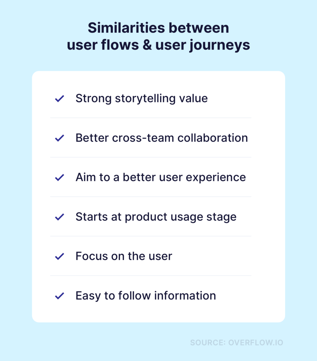
Although it’s obvious from the above that there are significant differences between these two Product Design essentials, there are some note-worthy similarities. These, however, should not be perceived as points of overlap but rather as a guide on how teams should view them, when trying to incorporate them in their workflows:
Differences of user flows and user journeys
Apart from the obvious, visual differences in execution, user flows and user journeys also differ significantly when it comes to the approach and methodology behind them. We have summarized the main differences in the table below:
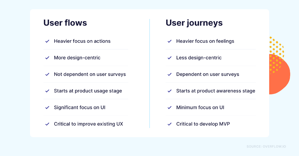
One thing is for sure: no matter their similarities and differences, both tools can provide teams with extremely valuable information and help them deliver a much better user experience. Since the two do not overlap significantly in methodology or output, they are considered complementary techniques throughout different stages of the product development or improvement process.
Useful tools to get you started
Depending on the purpose and fidelity of your desired user flow or user journey, there’s a variety of tools that can make your job easier.
You can build simple user flows with basic prototyping capabilities (screen to screen transitions) on any of the popular design tools, such as Figma, Sketch, or Adobe XD. However, if user flows are a critical part of your daily work and you are looking for a more interactive end result that helps the audience see both the big picture and the design details, we recommend specialized diagramming tools instead, such as Overflow.
When it comes to user journey mapping, whiteboard tools like Miro usually contain templates that can guide you in your first attempts. Alternatively, you can still design and present user journey maps in any of the aforementioned tools, especially if you have some prior experience or you prefer to build your own custom template. Additionally, since user journeys require user input, it’s important that you first conduct user interviews, either via conference call (Zoom, Skype, etc.) or by using the expertise of a more elaborate testing platform, such as Lookback or Userlytics.
Are you familiar with user flows, user journeys, or both? Which ones do you and your team like to use in your internal workflows? Let us know by sharing your thoughts via comment here or on our Twitter, Facebook, or Instagram accounts!
Article written and curated by Constantinos Vitoratos.
Build meaningful design presentations and engage your audience in design critique