
May was a celebratory month for Overflow: Back in May 2018 the tool first became available for public beta access. Just one year later, in May 2019, our team launched Overflow 1.0 for all individuals and teams worldwide.
A lot has changed in the past two years. To begin with, Overflow’s audience has not just become bigger but also much more diverse with the introduction of the Windows version, as well as Enterprise plans. Additionally, our team has worked on providing more options when it comes to syncing from design tools, building user flows, sharing, and commenting.
All the above led to the development of certain user flow diagramming patterns, which we found to be interesting to share. So, without further ado, here are the user flow diagramming trends for 2021 that our team identified:
User flows are going global
The need for effective, impactful product design is inarguably global and will only keep growing. However, there are certain cities and countries that are considered design powerhouses and make it year after year to top 10 lists and other publications: NYC, London, Toronto, Berlin, and Stockholm are some of the names you might have already encountered.
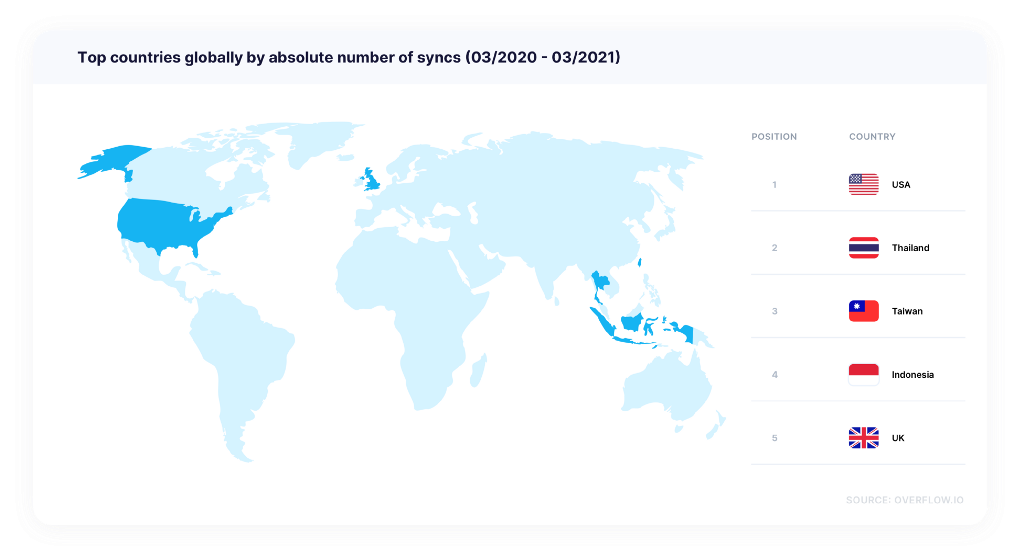
However, as digitally-driven companies are quickly taking over every corner of the world, emerging markets are soon bound to make it to the aforementioned lists, overthrowing traditional players. Our own numbers seem to confirm this trend, with Taiwan, Indonesia, and Thailand making it to the top 5 countries by a total number of design tool syncs, a clear indicator of production volume, as well as the adoption of user flow diagramming in daily team workflows.
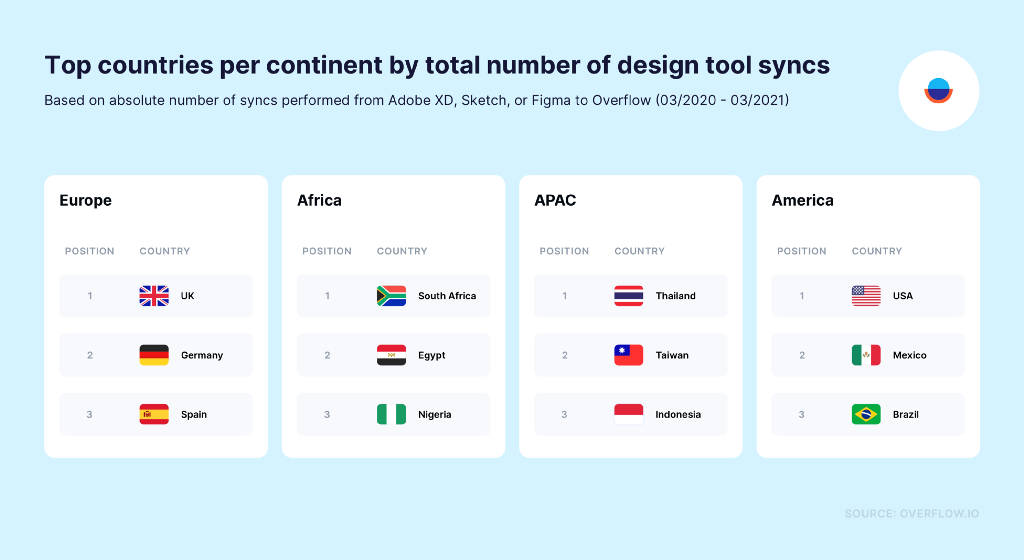
Looking at a continent level, we can see that Germany expectedly appears at second position in Europe (and 6th on a global scale, after the UK). South Africa has traditionally been the most active market when it comes to macOS Overflow usage on the African continent, however, since the introduction of Windows, Egypt and Nigeria have experienced steady growth and are hastily catching up. Another surprise is the high position of Mexico and Brazil in the American continent, each outnumbering Canada in the total number of syncs in the last few months — a trend also partially driven by the introduction of Overflow for Windows.
User flows are embedded in people’s work
User flow diagramming is not new; there are examples of companies that were using them in a hand-drawn or printed-and-stitched format already a decade or more ago. Nowadays that specialized tools, like Overflow, have largely streamlined an otherwise long and tedious process, users seem to be starting to include them more and more into their daily lives. Our numbers seems to agree 🤓
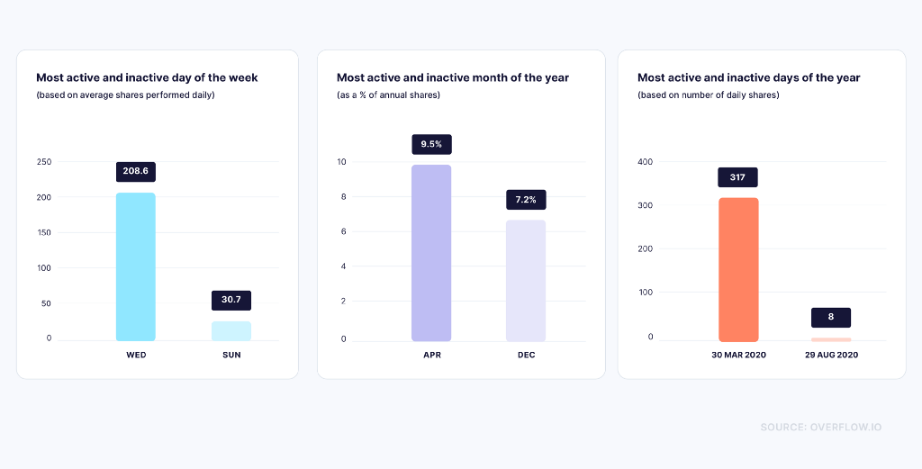
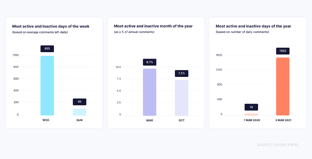
Looking at data related to when and how much the average user shares their work with peers and stakeholders through Overflow, we can see that Sunday is the least busy day of the week. Similarly, December, when much of the Western world is enjoying the Christmas holidays, seems to be slowing down in terms of sharing. Our least busy day in the last 12 months was at the end of August, another popular period for a summer vacation in much of the world. All the above clearly indicate that user flow diagramming peaks during busy working periods and slumps as people turn their working devices off.
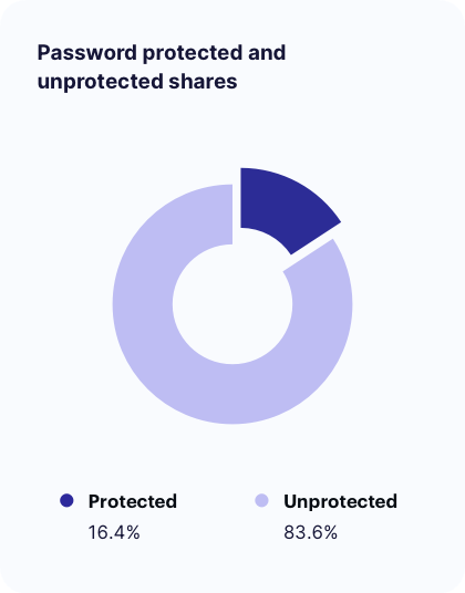
Another interesting finding is that the majority of users do not password-protect their shares, although the number of protected shares is certainly not insignificant. This could be because much of the information people share is not considered sensitive, or because of fear of forgetting/losing passwords and risking that some stakeholders might not have easy access at a later stage.
Tool dynamics are shifting
A few years ago, there were few flagship products with universal recognition in the design world. Nowadays, we live in an era of an abundance of options — new tools become available every so often, old ones evolve to keep up with the emerging competition, and users’ needs evolve along with them.
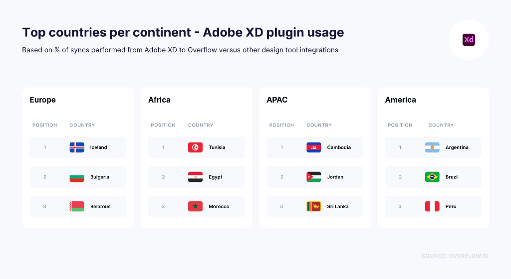
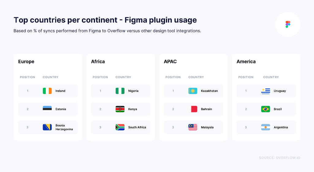
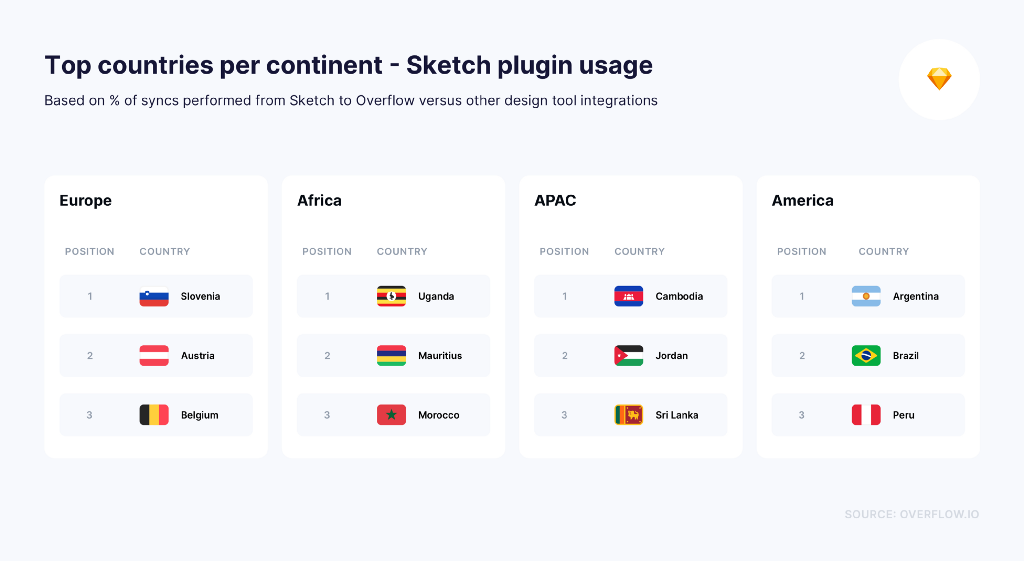
Overflow integrates with four popular design tools: Sketch, Figma, Adobe XD, and Adobe Photoshop, the latter introduced in late 2020 and thus excluded from much of this article’s data due to the lack of a big enough sample.
One of the most interesting things to explore was each tool’s volume of usage, as reflected through the number of Overflow syncs performed through each plugin available. This can’t and doesn’t reflect the absolute popularity of each of the design tools — either way that’s not something we are interested in figuring out, as we pride in our collaboration with all of these tools equally. It is only an indication of which tool is mostly combined with Overflow when it comes to our average user’s daily user flow diagramming routine.
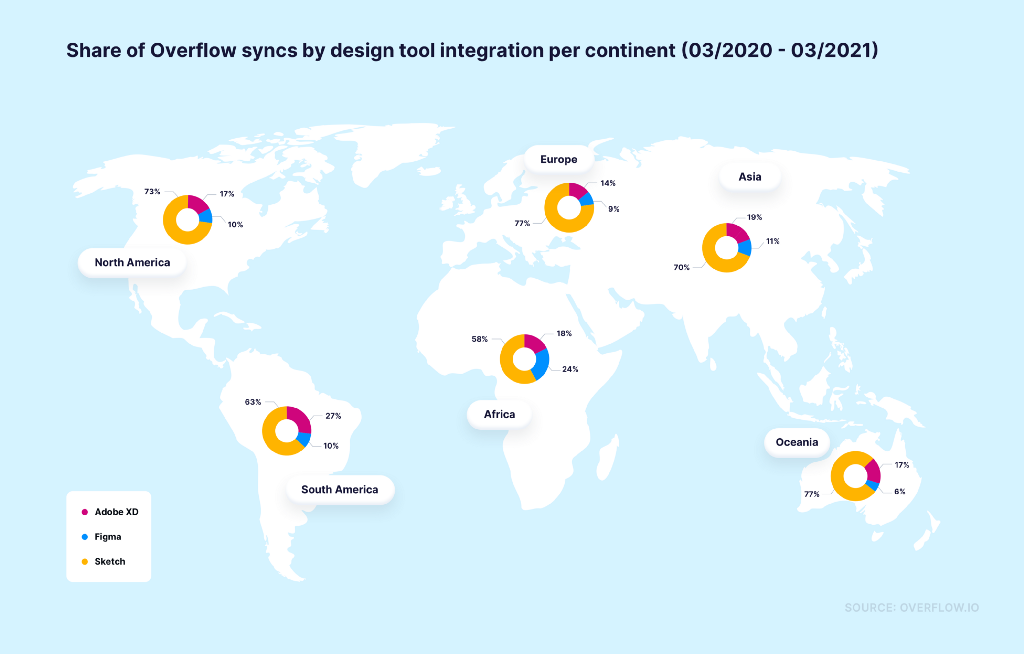
On a global scale, we can see that Sketch users tend to perform the majority of artboard syncs to Overflow in all continents, the biggest percentage observed in Europe and Oceania while the lowest in Africa.
Among all continents, Africa shows the most positive trend of syncing from Figma, especially as many African Overflow users use Windows as their OS. Similarly, in South America, where the ratio of macOS versus Windows users is about 1:1, Adobe XD wins a large piece of the pie and shows the most positive trend in artboard syncs to Overflow from all other tools.
As a general observation, syncs from Figma have increased in the past year compared to a year ago, however not equally fast in all continents. This could, however, also be attributed to the new Overflow plugin for Figma, which provided a more seamless integration between the two tools and encouraged Figma users to bring a larger volume of artboards into Overflow.
Below, we focus on each tool individually to find out which markets seem to be the most “loyal” to each one:
Windows is getting much of the pie
In our team, it had been our clear intention since day 1 to make Overflow available to all users, regardless of which operating system they work on. However, in our broader industry, it is often assumed that the vast majority of users do their day-to-day work on Mac devices. Interestingly, as the following map shows, Windows holds a significant proportion of Overflow’s user base, in some continents even surpassing the number of Mac users and showing a clear trend that seems to be going against the currently popular belief.
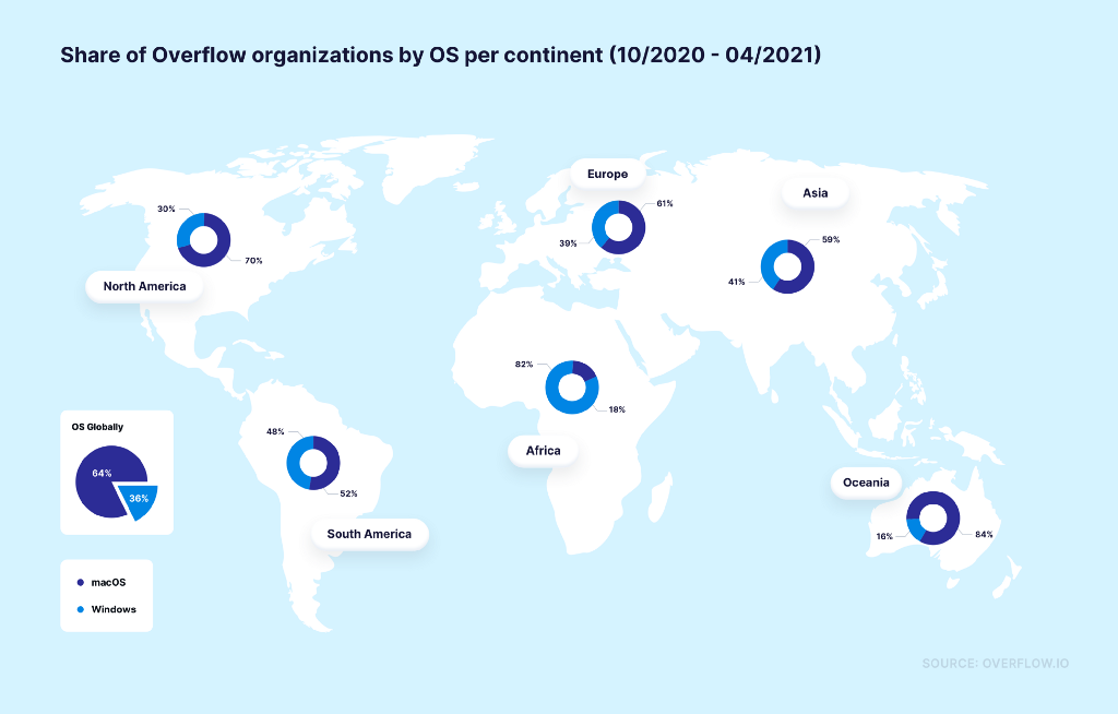
As mentioned earlier, this ratio of Windows versus macOS users also highly affects the preferred design tools of Overflow users, with Figma being increasingly popular in Africa and Adobe XD in Latin America. Our preliminary data also seems to imply that the user flow diagramming habits of the average Windows user is slightly different to that of the average Mac user; however, with less than a year of both versions of our tool available to the public, it’s still too early to make any concrete claims.
Asynchronous design critique is here to stay
Comments were introduced in Overflow in December 2019 and have since been one of the tool’s most popular features. Comments are essentially the easiest way to participate in asynchronous design critique; not only do they save time from meetings, but they also allow people working from different time zones to play an active role in projects from anywhere, anytime.
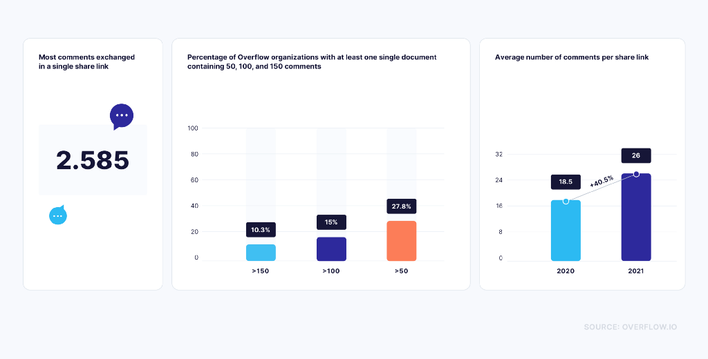
Interestingly, almost 28% of Overflow organizations have at least one share link with over 50 comments, proving how much information and feedback can be exchanged in a single document. If we take that number of comments even higher, we’ll see that 15% of organizations have at least one share link with 100 or more comments, and about 1 out of 10 have left at least 150 comments in one single share link!
The positive trend of leaving comments in share links and participating in asynchronous design critique is also proven by another metric: in 2020, the average share link had 18.5 comments. In just the first quarter of 2021, this number has grown by 40.5% and keeps growing slowly but steadily month after month.
Still, Overflow users are not equally chatty at all times. Sundays are particularly “silent”, possibly because the vast majority of employees around the world are enjoying some time off. Additionally, March (and spring in general) seems to be busier for many individuals and teams, a trend that is reversed towards the end of the year (October to December).
User flow trends are constantly changing
As mentioned earlier, user needs tend to shift constantly, and tools change along with them. This has been no different in Overflow’s case: within the past 12 months, we’ve seen our users change the way they build, share, and approach their user flow diagrams and design presentations. Part of this change has been driven by our own efforts to improve or speed up established processes, while the rest came from external influences.
As we always like to say, Overflow has as many use cases as its users can come up with. With that in mind, we are excited to see what new trends arise in the coming year.
Do the above trends match with how you and your team use Overflow? Let us know in the comments section below!
Alternatively, feel free to tag @overflowapp on Twitter, Facebook, and Instagram.
Build meaningful design presentations and engage your audience in design critique