Prototype vs user flow: Which is the best presentation format for UX design?
Vasilis Odysseos in Overflow Storybook

When was the last time you hailed a taxi on the street, or called a restaurant to order food? A long time ago, right? There’s an app for everything now. You order a car with Uber, you use Postmates for food delivery, and you use a slew of other apps to get you through the day. Our world’s not the same it was 10 years ago. Heck, it’s not the same it was last week! Like shooting stars, new startups pop up and fade out every day. Do you remember the days when the internet was just static pages you only visited when you wanted to look something up? With digital marketplaces like the App Store, our products can now potentially reach billions of users-users who might make our products part of their daily lives.
For digital product creators, this means we have to focus on usability to make a lasting impression. The end user always comes first, because at the end of the day, no matter where we’re working, we are designing for the user, and there are potentially millions of end users for our products. This means our design process must be optimized perfectly for our products to be designed perfectly.
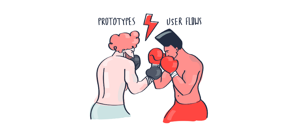
So, if we think about product development as a machine, each step would be a cog in that machine. For a smooth design process, those cogs need to be synchronized perfectly. But two new cogs that often clash, at least conceptually, are prototyping and creating user flows, because of misconceptions or misunderstandings about their role or their place in the process. So, should we just remove one of these cogs so they stop clashing, or should we find the right place for each, and keep the machine whirring? Time is money, and it might seem faster to throw one of the cogs out, right? So, let’s see which one would be better to dispose of.
Prototypes
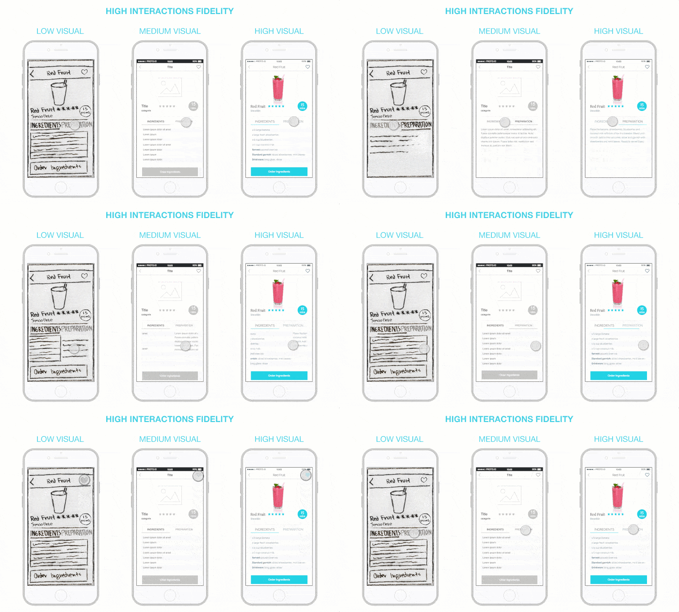
Prototypes help us in a ton of ways. Before writing code, even before we have final designs, we can easily create simple, low fidelity prototypes. Low fidelity can mean low visual fidelity, low interaction fidelity, or both. Low fidelity prototypes allow us to validate the concept of our app, while high fidelity prototypes are often indistinguishable from the real deal, so we can test everything, from visuals to interactions.

To create a prototype, we only need the bare minimum — the screens our app or website will have, and wireframes of those screens. Many prototyping tools allow us to import screenshots of our screens and add interactions over them so that we can navigate our products, screen by screen. We can then pass the prototypes on to potential users, ask them to test them out, to see what they like and dislike.
Our users will likely come back with comments like “I don’t like the color of this button,” or “I don’t like the placement of this button.” These comments help us ensure that our screen layout is correct and that our interactions do what the user expects them to do. We don’t want to confuse users. So, prototypes help us improve the user interface.
However, the constraint of viewing the product screen by screen is that people tend to focus on the smaller details and ignore the bigger picture. We don’t know which steps our users can take to get from one screen to another, or to complete a task. How might the user experience their journey overall? How might they get to the task, and how might they feel about the journey? Does our screen placement make sense, or are there too many steps to complete certain tasks? The easiest way to answer all these questions is by creating user flows.
User Flows
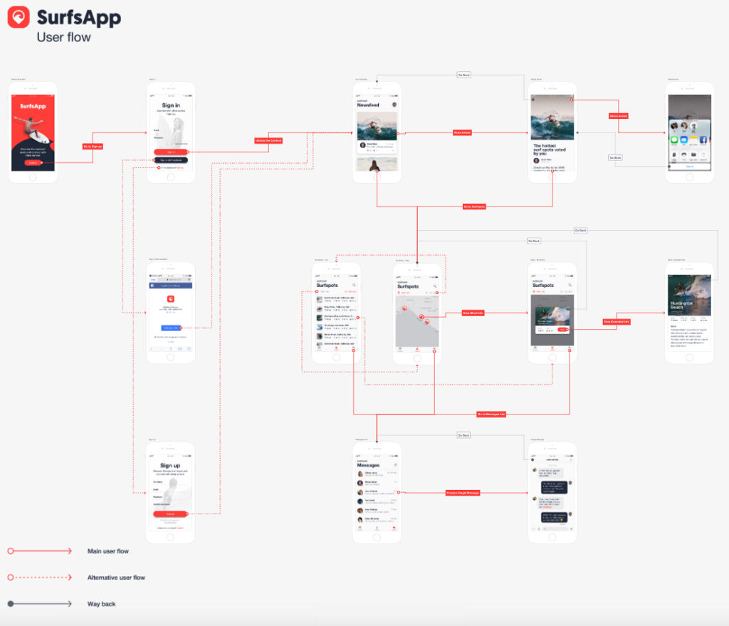
User Flows, and by extension, user flow diagrams, allow us to view the bigger picture of our product, and simulates the total user experience. They don’t constrain us to a single screen, we can easily zoom in and out to see all screens at once or one at a time, and see how screens are interconnected. We can then look at all our subflows to make sure that each one is optimized to require as few actions from the user as possible.

With user flows, we can simulate the flows of different personas, tasks, and entry points, making sure that each flow is clean and simple. This helps us improve the overall user experience, rather than just the user interface.
On the other hand, user flows have been traditionally cumbersome to create, due to the lack of specialized tools. When using traditional flow diagramming tools, our user flow diagrams often end up looking like a bowl of spaghetti, with connectors running through a screen, and requiring us to squint our eyes while we carefully follow each strand. And, if we make changes to our designs, which is an important and inevitable part of the process, we have to re-import a screen, recreate the connectors and re-output the project to a PDF file or even re-print the whole thing. There is now at least one tool out there to make this process way simpler, though: Overflow 😉
And the winner is…
So, when we weigh the pros and cons of both, we really can’t dismiss either, because they each do different things. And, where one fails, the other one works.
When we asked our Twitter followers which they’d rather use for the rest of their lives, the results were pretty close, with a slight lean toward user flows (but most of our followers are Overflow users, so…).
Overflow on Twitter
Hey twitter, if you could only do one, which would you pick? 🤔 Let us know why with a reply to the poll
But, any bias aside, many replies said they’d prefer something like a hybrid of prototypes and user flows:
Spencer Camp on Twitter
@overflowapp I prefer the "interaction flow". Hybrid prototype / user flow.
Brian Moon 👓 on Twitter
@overflowapp Interactive prototypes are the best way to illustrate a user flow. That being said, I still think it's crutial that designers mock up a flow early on when user flows aren't solidified.
Bringing prototypes and user flows together, then, gives us the ability to view our product’s bigger picture, while still having the option to look at the details and modify visuals and interactions. So, to run smoothly, the machine needs both.

Build meaningful design presentations and engage your audience in design critique