With the heavy attention that UX and UI have received in contemporary product design, designers nowadays have access to a wide arsenal of tools and methods to improve their daily workflow and achieve maximum productivity. In this article we are putting the spotlight on mind maps, one of the easiest to produce but less frequently used tools in product design.
What is a mind map?
From a product design standpoint, a mind map can be defined as a visual representation of contextually-related ideas and concepts. A mind map is a hierarchical diagram that shows the relationships between different pieces of information. It is often used as a tool for brainstorming, ideation, and problem-solving.
What does a mind map look like?
Contrary to other diagrams that can take a large variety of forms, most mind maps come in one of two formats:
Tree format
This is the most commonly encountered type of mind map. It takes its name from its layout, which puts a main idea, concept, or problem in the center, while solutions or ideas branch out around it in all possible directions.
The benefits of this format are that it’s simple, easy to make, and easy for any audience to follow and decode. However, at the same time it’s based on a rather restrictive hierarchy that doesn’t allow for much flexibility.
Graph format
Compared to the tree format above, the graph format is less restrictive, as it doesn’t only visualize forward relationships between one ‘parent’ concept and multiple ‘children’ ideas. Here we also see interconnections between ideas, or even backward connections between an idea and the parent concept or problem.
As already mentioned, the benefit of this format is that it allows us to map more connections and, thus, achieve a more holistic result. That being said, choosing this format poses the risk of adding way too many layers and getting into a level of thinking that might be too deep for the early ideation process.
How can mind maps help in the product design process?
As a general principle, the main purpose of mind maps is to facilitate brainstorming and allow people to organize their thoughts in a way that helps them produce more structured, well-thought-out output.
Mind maps related to UX, UI, or product design are usually not limited to visualizing connections between ideas. They can also include research findings, project requirements, persona characteristics, and all these other elements that should effectively be taken into consideration. By visually mapping out the various components of a design problem, designers can more easily identify patterns, connections, and opportunities for innovation.
Except for serving as a guide for better, more innovative design work, a mind map can also be an excellent presentation tool. As a visual and uncomplicated type of diagram, it can easily be used in the early ideation process instead of a user flow diagram or a flowchart to get stakeholders aligned. And since the three diagrams serve different purposes, mind maps are preferable when the conversation still revolves more around concepts and problems, than actual UI connections or steps of a defined process.
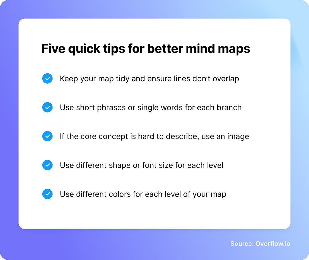
Five quick tips for better mind maps
Simple as they may be, mind maps do require a level of attention to detail, in order to remain clear and useful for both the designer and their audience. In summary, here are 5 simple rules you should always follow when introducing mind maps in the product design workflow:

Have you ever tried to include mind maps in your product design workflow? How did you and your stakeholders find the experience? Share your thoughts by commenting here or on our Twitter, Facebook, or Instagram accounts!
Article written and curated by Constantinos Vitoratos.
Build meaningful design presentations and engage your audience in design critique