When we set out to build Overflow, the world’s first user flow diagramming tool tailored for product design teams, we wanted a memorable brand. A couple of years later, as the product was becoming more mature, we started asking ourselves questions that are very familiar to all product people: Do we rebrand? When is the right time to do so?
When we first asked Silo for help with our original branding, we would describe Overflow as a tool that helps designers save time in creating user flow diagrams. Back then, we aspired for our new product to be seen as easy-to-use, fun, but also practical and efficient.
Ever since we saw Overflow’s purpose become more layered. We simply couldn’t ignore that a large part of our community used the tool to improve their design communication and presentation workflows. It became increasingly clear that Overflow still felt easy-to-use, fun, practical, and efficient, as we originally envisioned, but now also felt creative and communicative. Once we realized this, we instantly had the answer to our questions.
Our Process
Visualizing a new identity
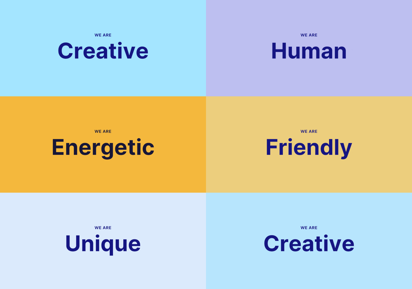
Our design team started working on a moodboard, visualizing Overflow as a human being and trying to give it a personality through adjectives, colors, shapes, and textures. The new Overflow was seen as creative, unique, playful, and friendly. Accordingly, the suggested brand color palette was softer than the original to reflect this friendliness and approachability, based mostly on different hues of cyan, orange, and purple. Our designers also recommended secondary colors to add depth to the brand colors, such as blue and yellow.

Elevating the Overflow logo
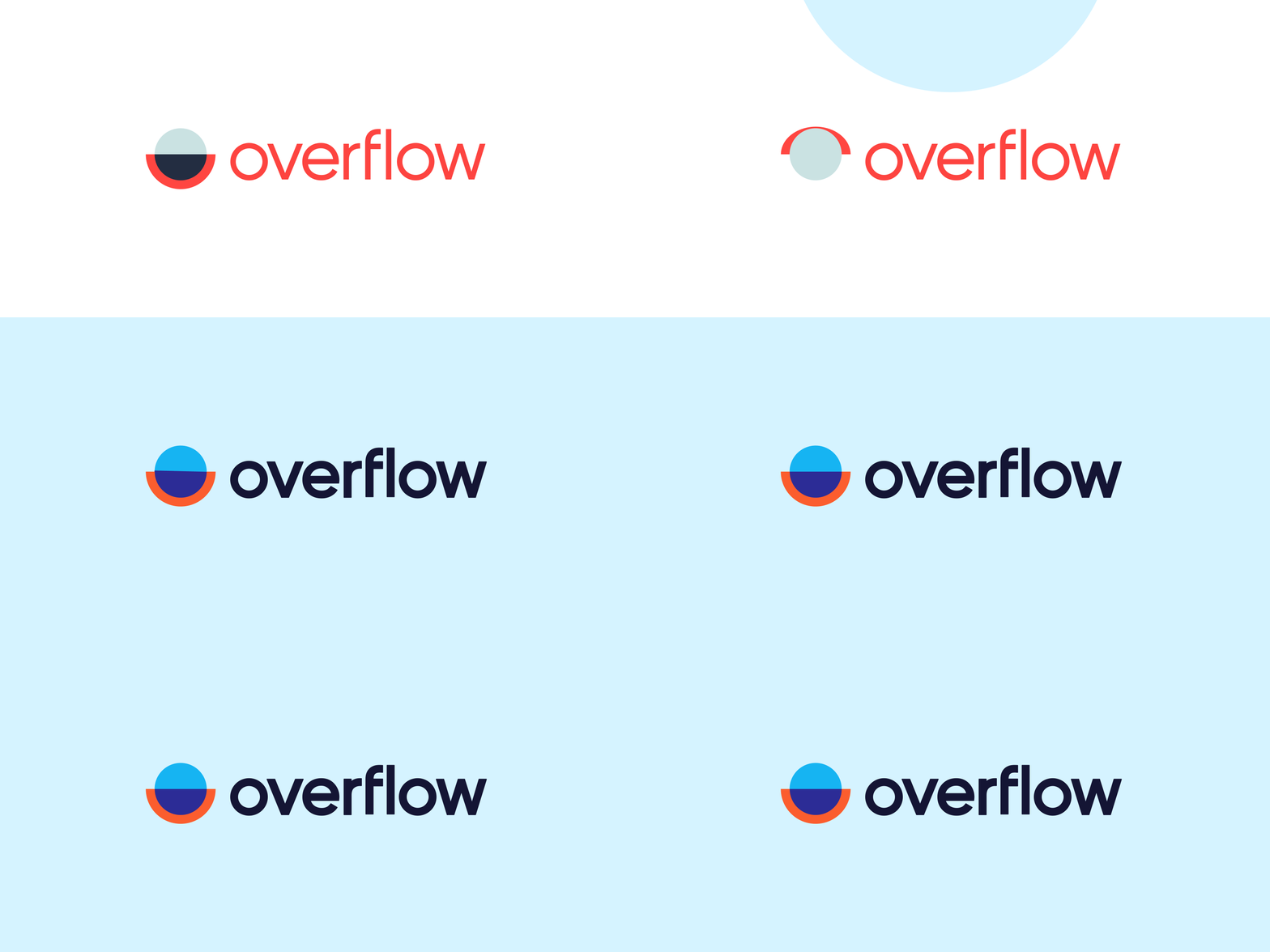
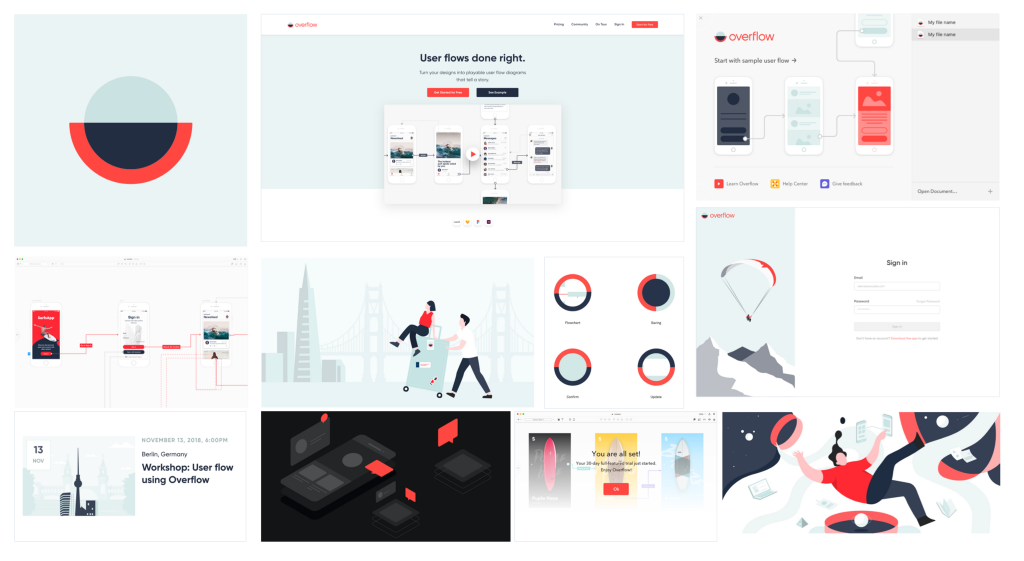
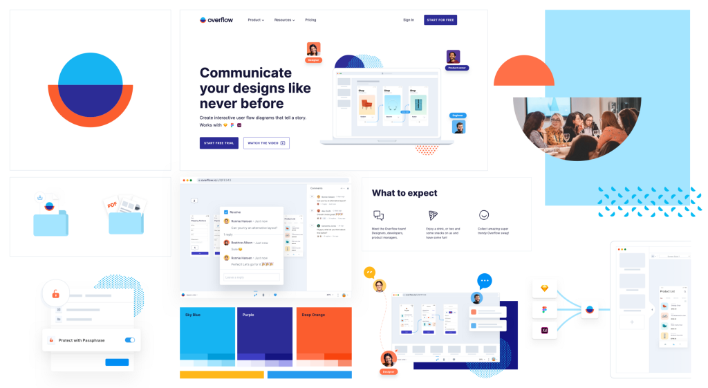
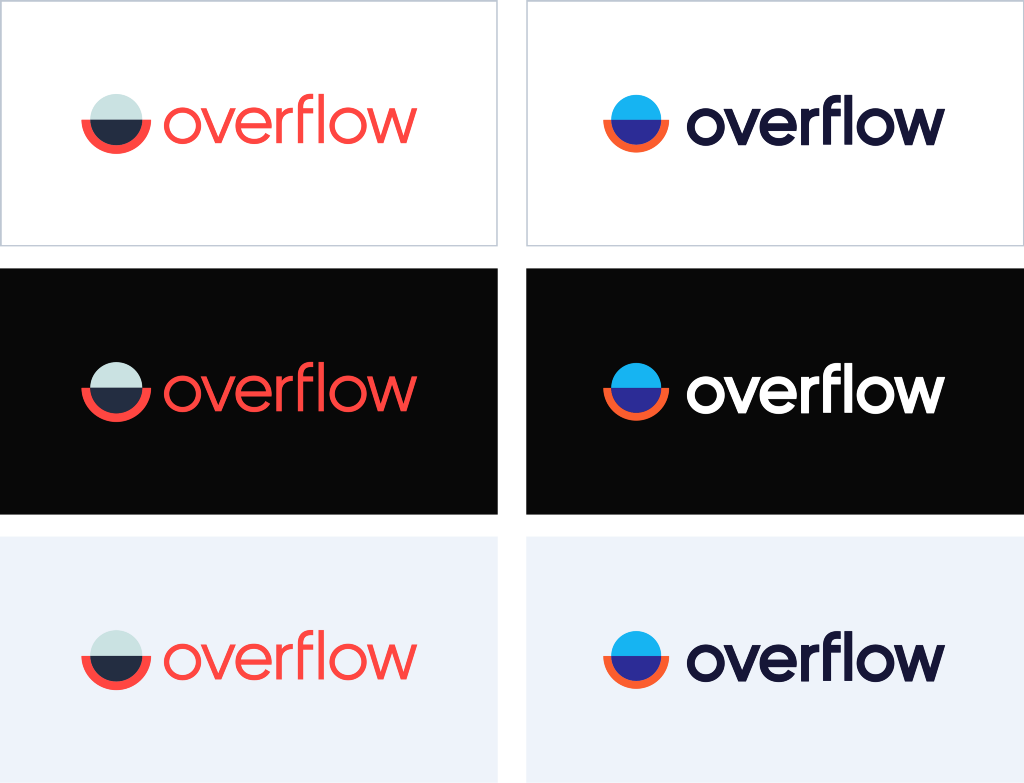
First and foremost, our color choices majorly impacted our logo. Some pre-work had already been done with Silo, who suggested a bolder font for the logo’s text part; we adopted their suggestion early on in the rebranding process. Colors, however, were equally crucial. As much as we love our old logo, it was not always practical: it often blended into monochrome backgrounds, and its application on printed material (t-shirts, caps, etc.) was far from ideal. Our in-house designers tried dozens of combinations based on that knowledge to achieve that sweet balance between personality and practicality/accessibility.
Incorporating branding into UI
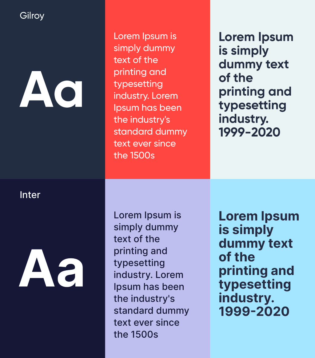
Another thing that was proven to be not practical was our old typeface. As our original brand was finalized before the actual app was developed, we realized that Gilroy did not work well as a typeface for the tool itself. In an effort to achieve higher user interface and marketing consistency, we decided to make the switch to Inter, which is not only perfect for user interfaces but also works very well in marketing. Another strong point for Inter is its compatibility with all major writing systems, making it ideal for a potential future decision to localize for a new market.
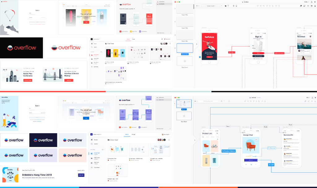
For the same reasons of bridging the gap between marketing and product, our design team developed a uniform, consistent design system that covered all aspects of our website, social media presence, as well as product interface. Buttons, dashboard colors, and all other UI elements were updated to match the new guidelines. A quick look at the comparison boards below will give you a clearer idea of what changed:
Creating illustrations that matter
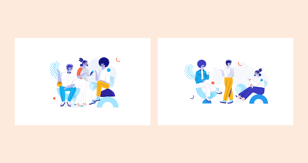
Realizing the power of illustration in adding character to any brand, we gave ourselves plenty of time to experiment. Our aim was to create something both memorable and fitting to our new brand concept. For our human characters, the goal was to come up with an “agnostic” race that bears elements of all that makes humanity unique, irrespective of background.

We also tried to avoid strong gender stereotypes regarding posture, clothing, and behavior. The glasses started as an experiment by our illustrator, but we couldn’t see our characters without them anymore by the end of the project! Lastly, we played with shapes and patterns to add an extra layer of playfulness and liveliness to our compositions.
Bringing the brand to life
Our motion design efforts were approached with a similar mindset. Overflow’s logo and name both convey a sense of fluidity and uninterrupted flow. Our new promo video plays a lot with morphing, transitions, and a sense of continuous flow, even when moving from designing the pyramids of ancient Egypt straight to today’s remote product design teams! Click below to see for yourselves:
Takeaways
During this 3-month rebranding process, we saw ourselves change alongside the Overflow brand. Our team spirit became stronger, we developed new processes to optimize our collaboration, and had multiple chances to get out of our comfort zone.
In retrospect, if we could keep a few learnings from the whole process, these would be the following:
- Re-evaluating an existing brand is not time-dependent. Products evolve alongside their users, and branding should be a mirror of that evolution.
- Don’t be afraid to ask yourself difficult questions when it comes to changing your brand.
- When you run a rebranding exercise, think of your brand as a human being. What would they be like? How would they feel?
- Always align all elements of your product, branding, and promotional efforts at an early stage. Once things get launched, they instantly become harder to change.
- Give yourself time to experiment. Your new brand will stick with you for a significant amount of time, so make it something you are confident about.
What do you think about the new Overflow brand? Does it reflect how you feel about Overflow’s direction, features, and capabilities?
We’d love to hear from you, either in the comments below or on any of our social media channels.
Article written and curated by Constantinos Vitoratos.
Build meaningful design presentations and engage your audience in design critique