Create stunning user flows that tell a story
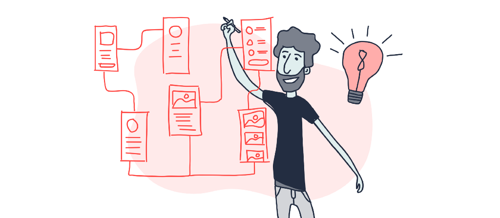
User flows are visual representations of the path the user can follow to achieve a goal while using an app, website, or any other product. Creating a representation like this helps designers reflect on the flow themselves, communicate it with the team and stakeholders and get feedback. User flows also allow designers to compare alternatives, as well as evaluate and test them with real users before proceeding.
The better designed the user flows, the easier it is for the audience to understand the story behind the designs and, therefore, the more constructive the feedback they will give. Drawing from our experience, we present a list of eight useful tips, targeting primarily designers who are new to user flow diagramming.
#1 Use meaningful titles
Meaningful titles/headings help your audience understand the flow they see. Designers often use the name of the project as a title, e.g., “XYZ Bank — iOS app.” Even though this kind of title is accurate, sometimes it may not be enough to describe what the user flow exactly represents. Specifically, in the case of subflows, the title could include information about the part of the user journey, e.g., “First-time user onboarding, XYZ Bank, iOS app.” or “Depositing money into your bank account, XYZ Bank, iOS app.”
Alternatively, the project name, as well as the device name, can be used as branding and captions elsewhere so that your title is kept even shorter, e.g., “First-time user onboarding.”
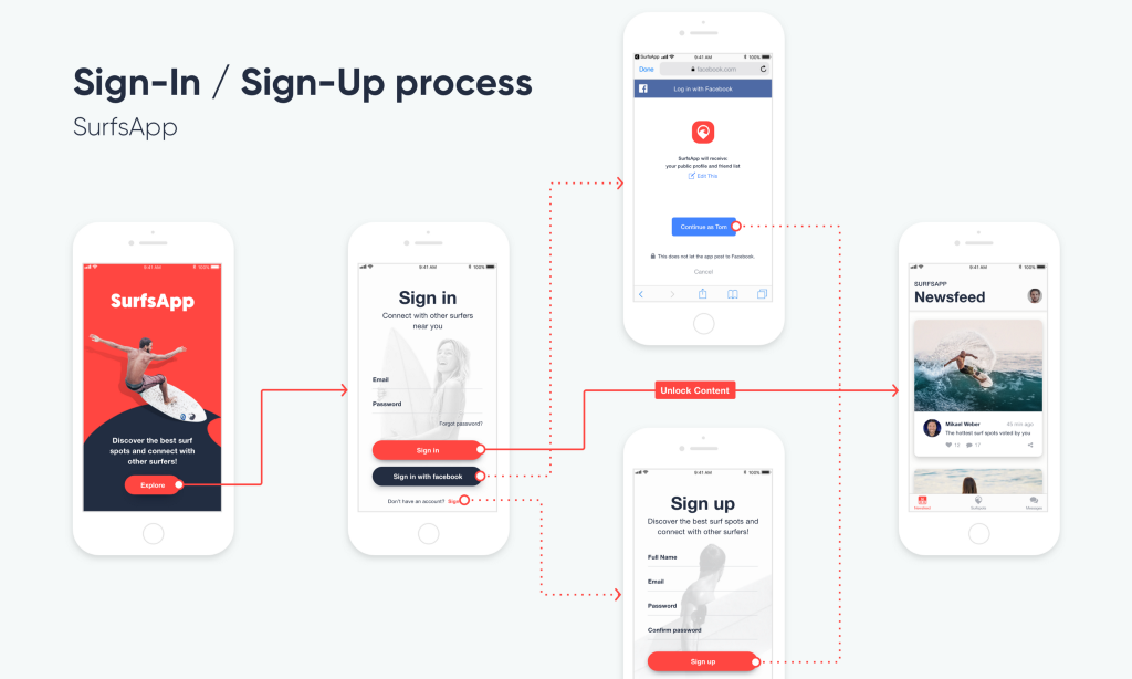
In cases where user flows of the same app, website or other product are different for different user personas, it is beneficial to also include the specific user persona in the title.
#2 Leave adequate space between screens
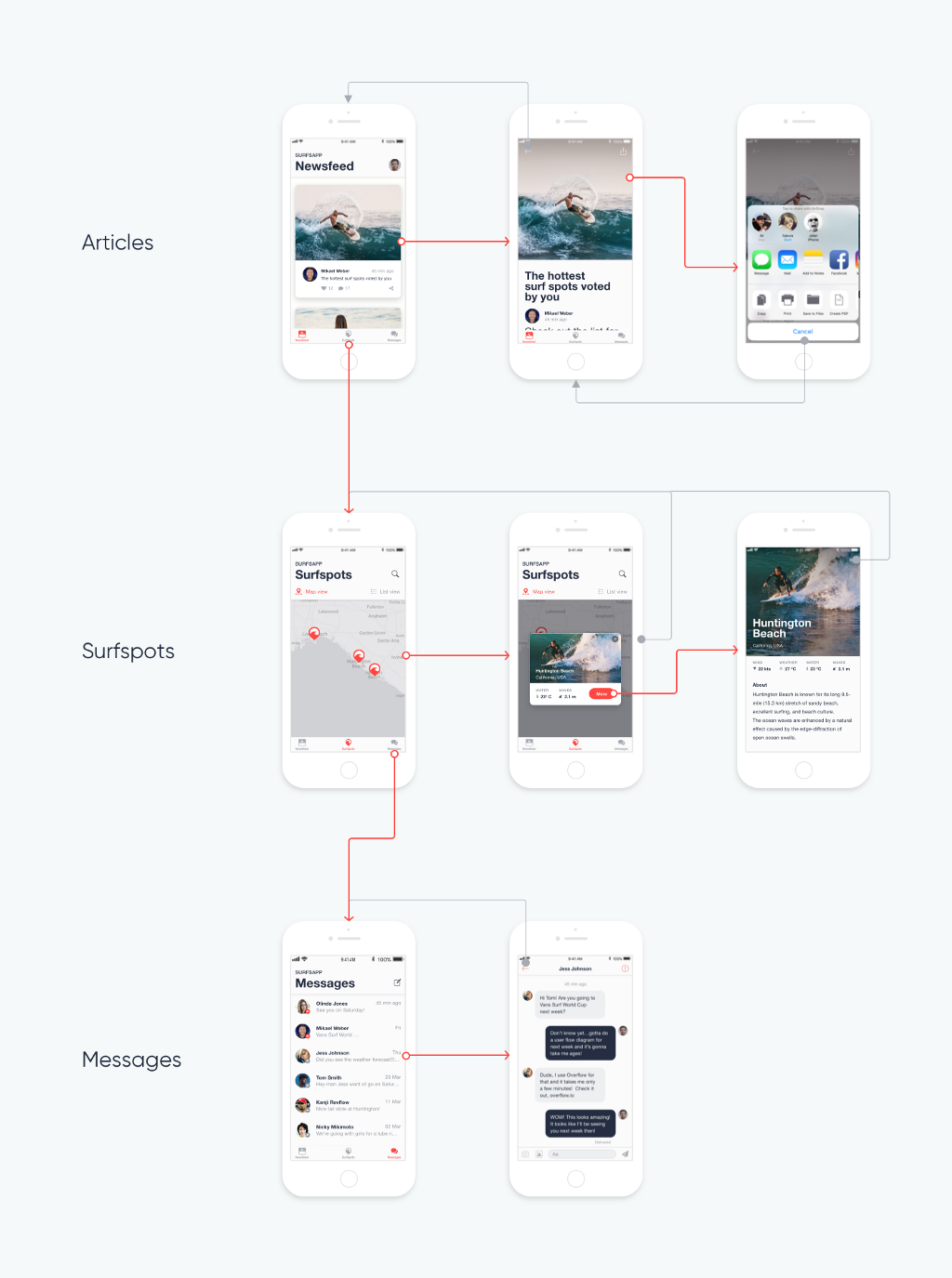
Position your screens logically and use space between them to increase clarity. Adequate space will also help flows with multiple connectors with labels appear cleaner and less cluttered.
Branch out subflows to different directions so that they can be easily distinguished. The position of your screens should ideally reflect the Information Architecture of your app (as shown below).
Tip for Overflow users
Overflow allows you to easily space out selected screens in the Editor by using the ALT + arrow keys to increase or decrease the distance between them, vertically or horizontally.
#3 Include device skins when necessary
When presenting user flows, especially in flows of mobile apps, it is sometimes more effective to include device skins around screen designs. Device skins can put designs in context, allowing the user to associate the medium with the design, e.g., a mobile app or a smartwatch app, etc. Moreover, in the case of screen designs that are bigger than the device dimensions (either in width or height) because they are meant to be scrollable, including the device skin gives you an indication of which part of the design would be visible.
Tips for Overflow users
You can show device skins with a single click. You can stylize device skins so that they match your canvas background or design colors.
Showing device skin on screen designs that are bigger than the device dimensions will make the particular screens automatically scrollable in the rapid prototype.
See an example in this Overflow presentation. Switch between the two boards to see the same user flow with and without device skins.
#4 Use different connectors styles to increase clarity
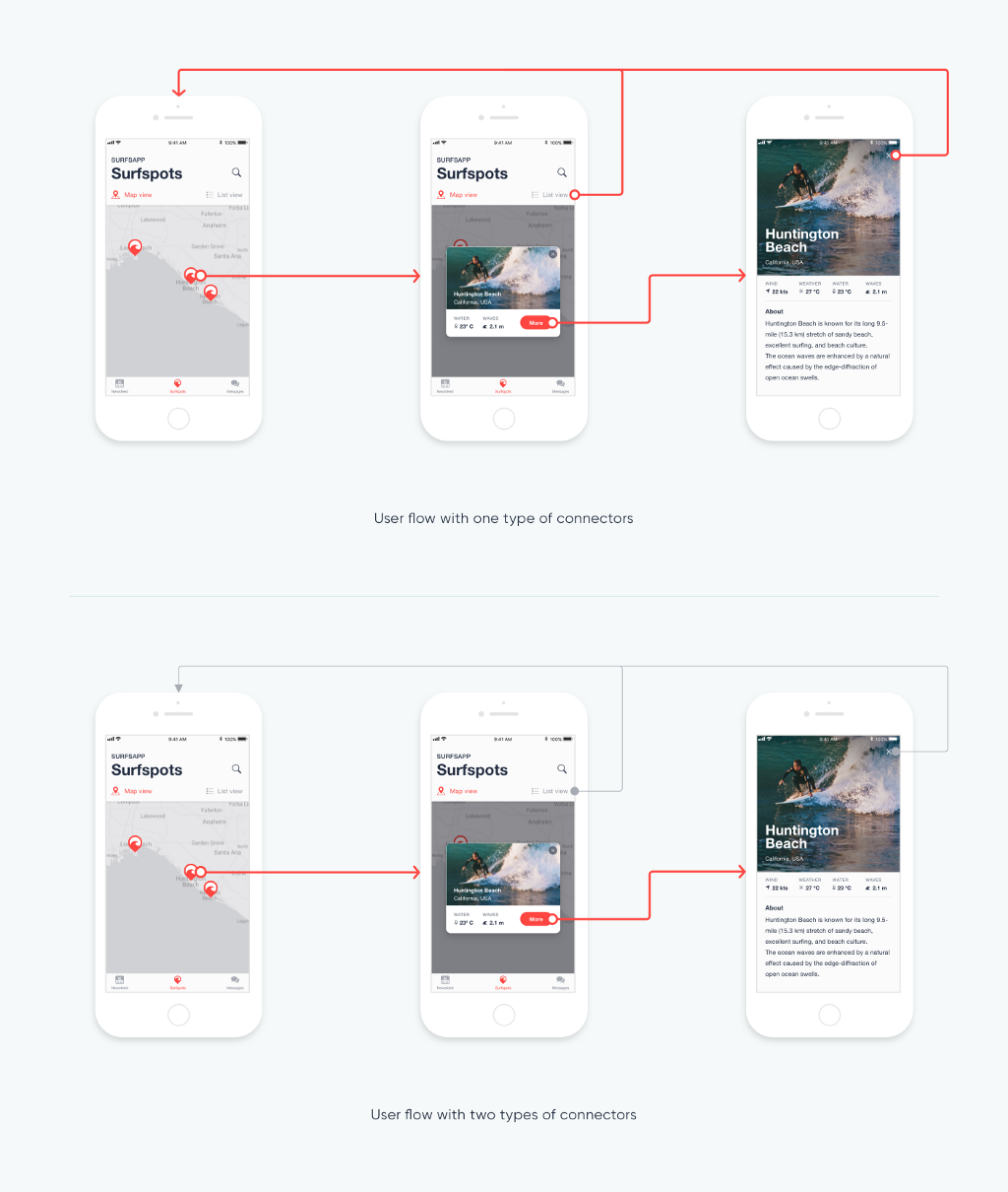
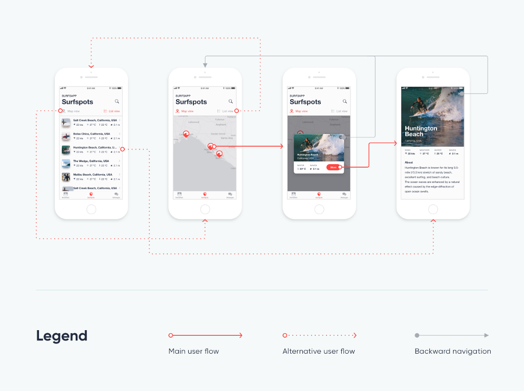
Connectors represent the interaction points and the path the user follows when navigating an app, website, or other product. When creating a user flow, it is essential to make the audience understand the flow, and having numerous connectors coming in/out of screens might make this challenging. This is especially true when all connectors are styled in the same way.
Styling connectors differently depending on semantics or other factors will help address this problem. For example, connectors that represent the backward navigation could be less prominent: with a softer color (or gray) or a dotted line (as shown below).
Tip for Overflow users
In Overflow, you can quickly set up the desired connector style and apply it to selected connectors or just instantly change particular style properties and get all connectors with that style updated.
#5 Use connector labels to explain actions
Connectors are frequently self-explanatory as they show both the interaction area and the target screen. However, adding text labels to them will sometimes help the audience better understand the flow.
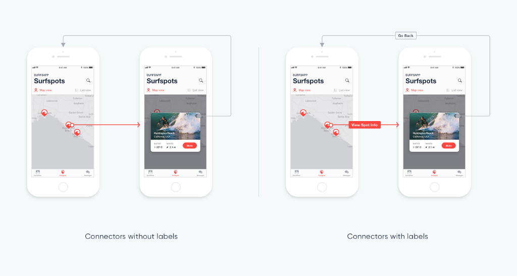
There are several cases, like the case of decision points, where connector labels become necessary because you need to show when the flow will follow one path vs. the other. Labeling connectors is also useful when linking two screens directly (without picking layers as starting points), as the action is not obvious in that case.
#6 Use a legend to describe connector styles
When we have two or more connector styles, it is necessary to add a legend in your user flow so that our audience can refer to it and understand what each connector style means.
#7 Use shapes purposefully
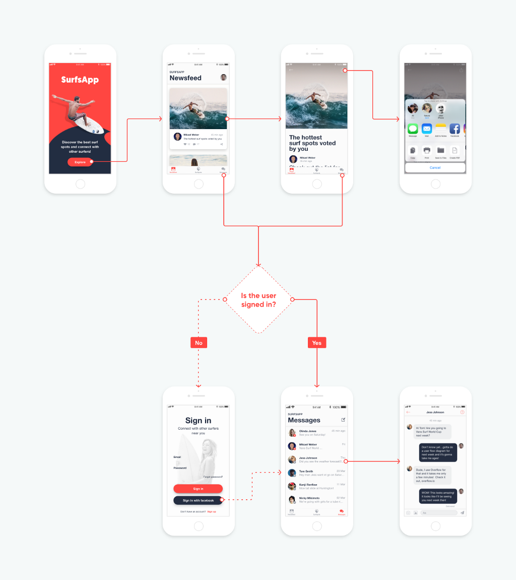
Shapes like rectangles, ovals, and diamonds can be used in user flows in multiple ways. For example, rectangles can be used for grouping, for setting background in a specific part of the flow, as notes, as a step where no design is yet available, etc. Diamonds are mostly used to represent decision points, where the user flow needs to branch out to different directions.
In earlier stage user flows, shapes can play an even more central role: rectangles can represent screens or steps in the user flow, ovals can be used for start/end or to link two subflows, and diamonds for decision points.
#8 Break down large user flows in subflows
Massive user flows tend to be hard to follow. It is often necessary to break down large flows into multiple subflows. Take for an example an extensive e-commerce website or app that includes user registration, sign-in, user preferences, checkout process, payment, product browsing, etc. Such a flow could consist of too many screens, thus making the flow appear complicated and difficult for the audience to follow. By breaking down each big flow into smaller subflows, it becomes easier for the presenter and the audience to focus on the big picture but also on the details.
Tip for Overflow users
In Overflow, it is suggested to use multiple boards when you have to deal with large user flows. One board may include the entire user flow, and other boards may include its subflows respectively. See an example in this Overflow presentation.
Duplicating boards, as well as copying and pasting parts of your flow to different boards, makes this effortless. More importantly, you can keep your designs up to date on different boards by simply syncing again from Sketch.
Creating effective user flows needs practice. Both the design and form of a user flow are vital as they contribute to how well the audience understands the story behind the user flow. By following the tips described above, you get one step closer to beautifully designed, and well-structured user flows that can communicate the design story clearly and effectively.
About Overflow
Overflow is the world’s first user flow diagramming tool tailored for designers. It offers a new, impactful way for designers to effectively communicate their work while fully engaging their audience with an interactive user flow presentation. Overflow is a product of PROTOIO Inc., the mobile app prototyping vendor of the popular prototyping platform Proto.io.
Build meaningful design presentations and engage your audience in design critique